Vulcan Real Estate
A New Foundation
Scope: Visual Identity, UI/UX
Role: Design Director, Lead Designer
Year: Q2 2022-Q2 2023
Agency: Turnstyle
A brainchild of Microsoft co-founder Paul Allen and the engine behind Seattle's vibrant South Lake Union neighborhood, Vulcan Real Estate is one of the Pacific Northwest’s most respected developers. After Allen’s passing, the team at Vulcan saw a need to reposition themselves in the market and reimagine their vision for the future.
Alongside our partners at Stoke Strategy and Metric Media, we helped breathe new life into Vulcan’s brand with a revitalized mission/strategy, visual identity, website, and microsite.
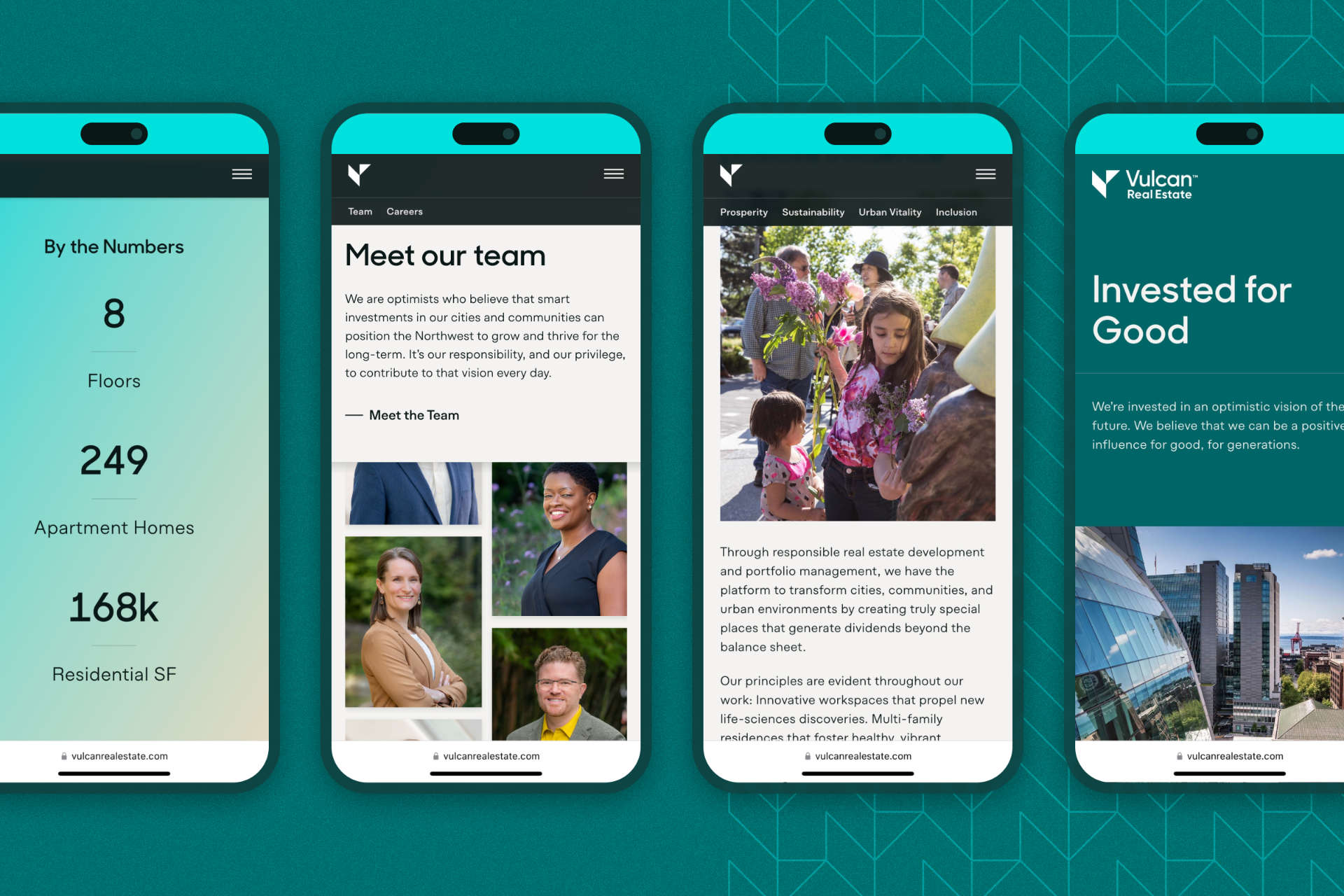
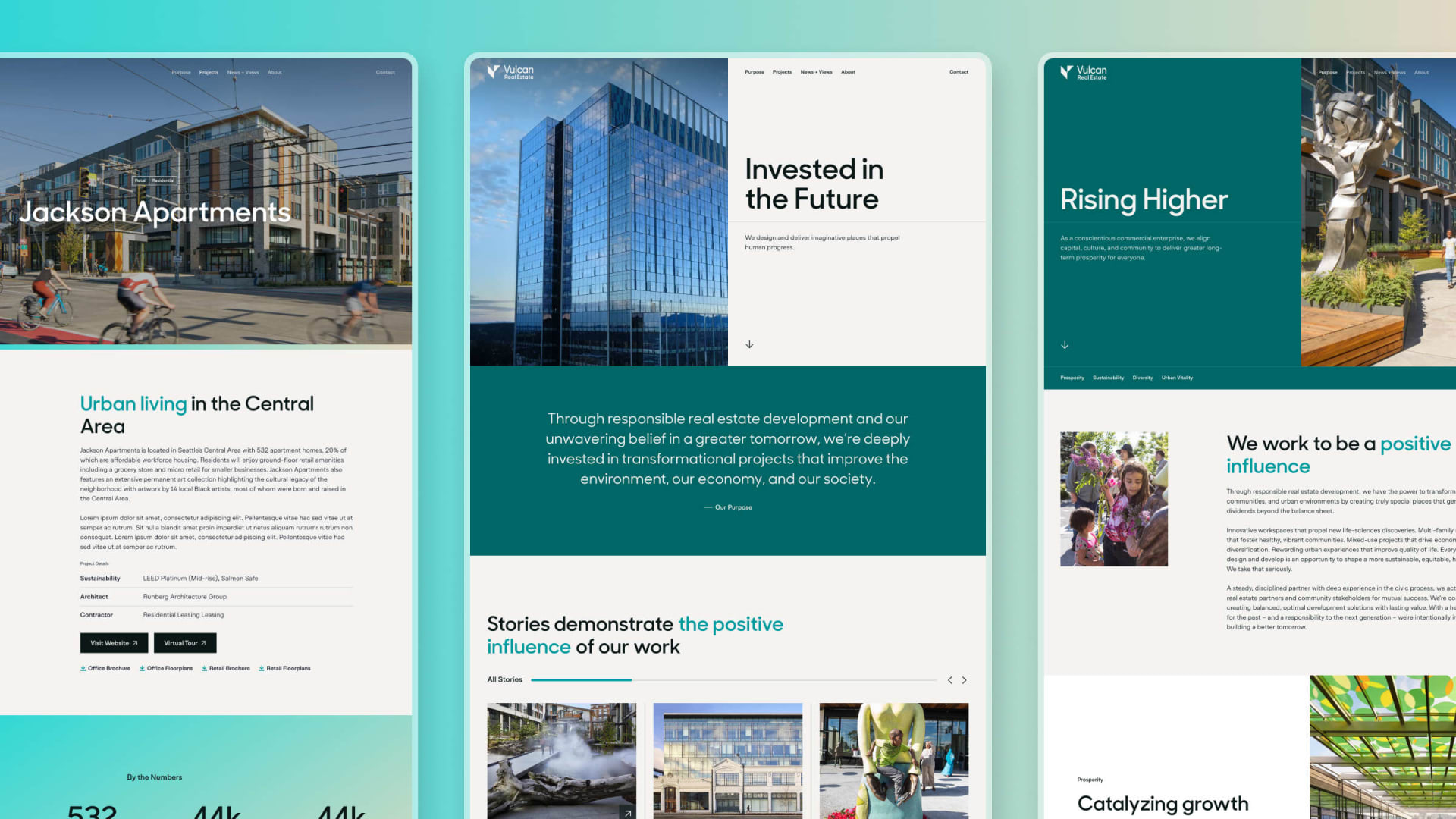
Homepage of the redesigned Vulcan Real Estate website
Establishing the Identity
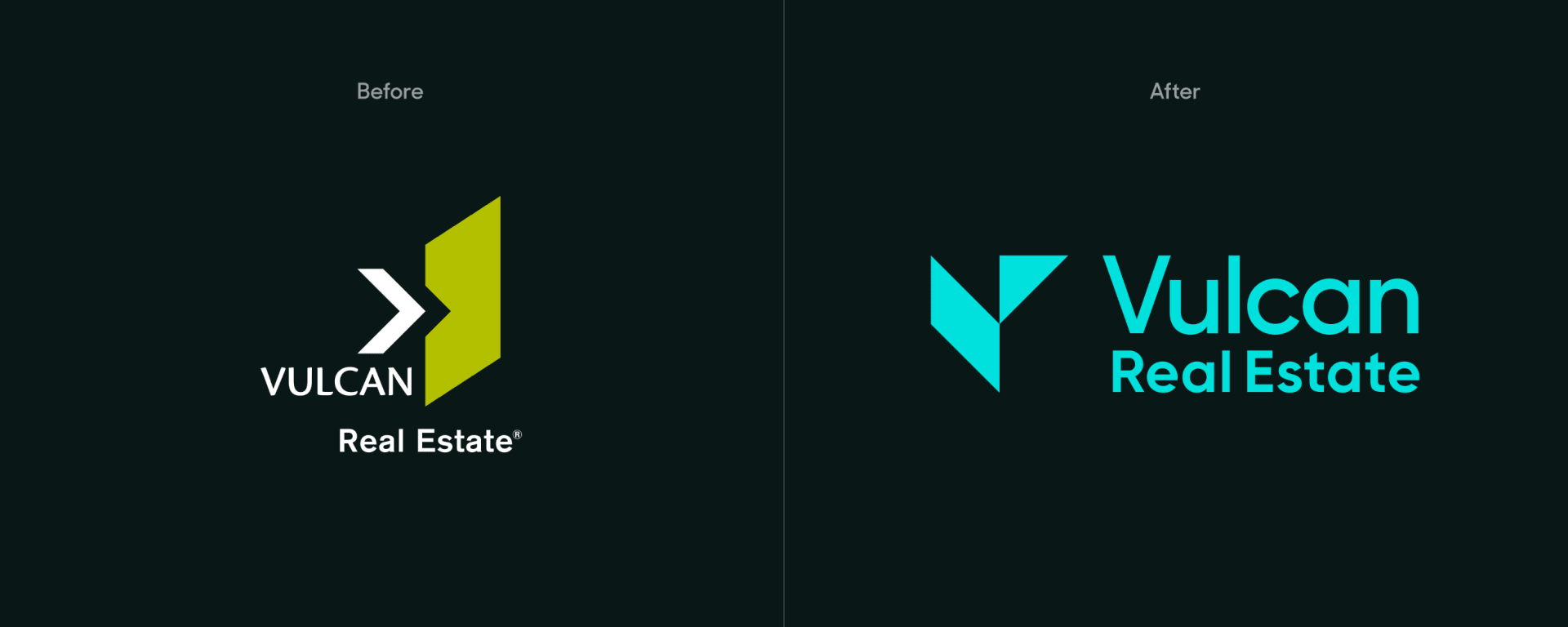
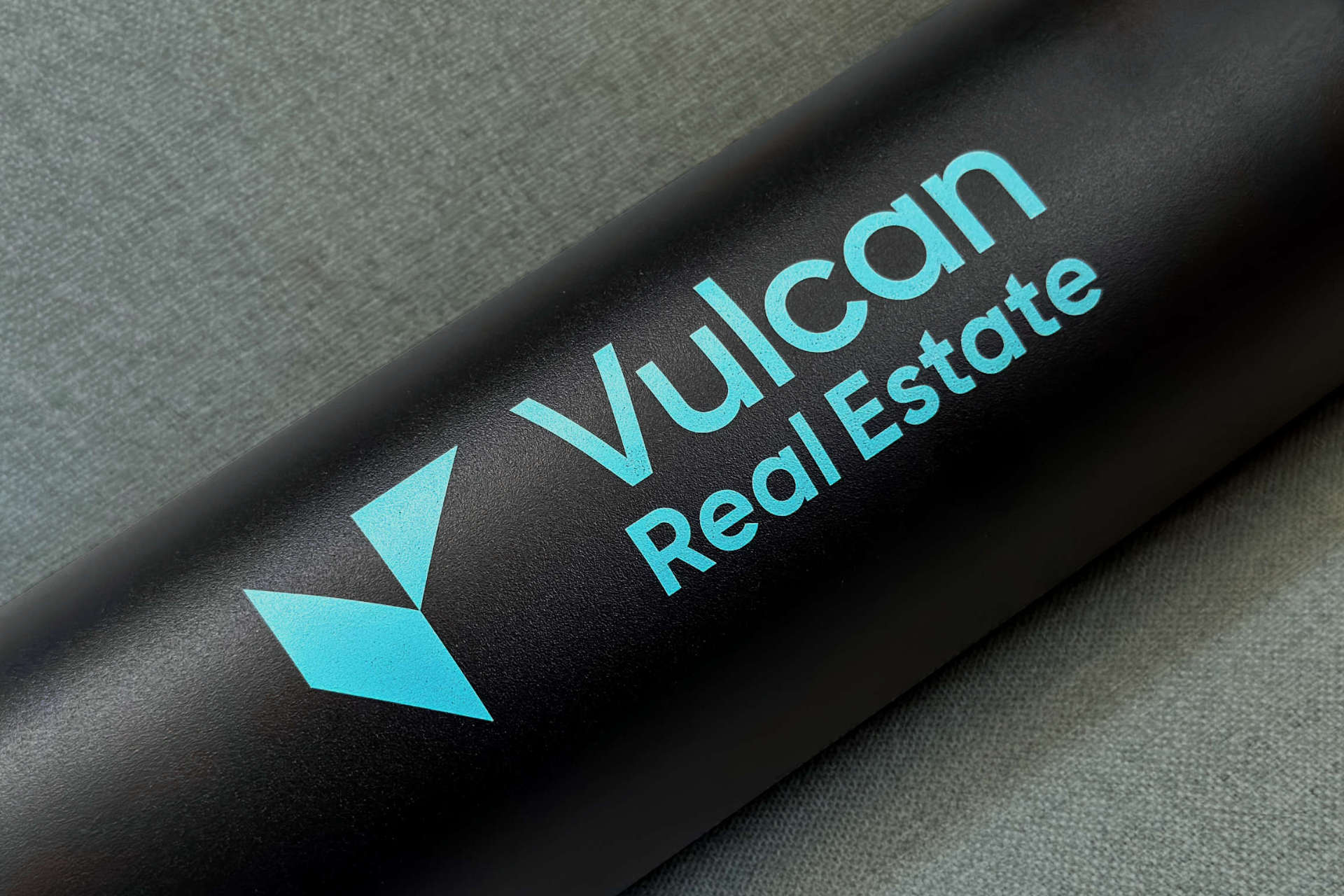
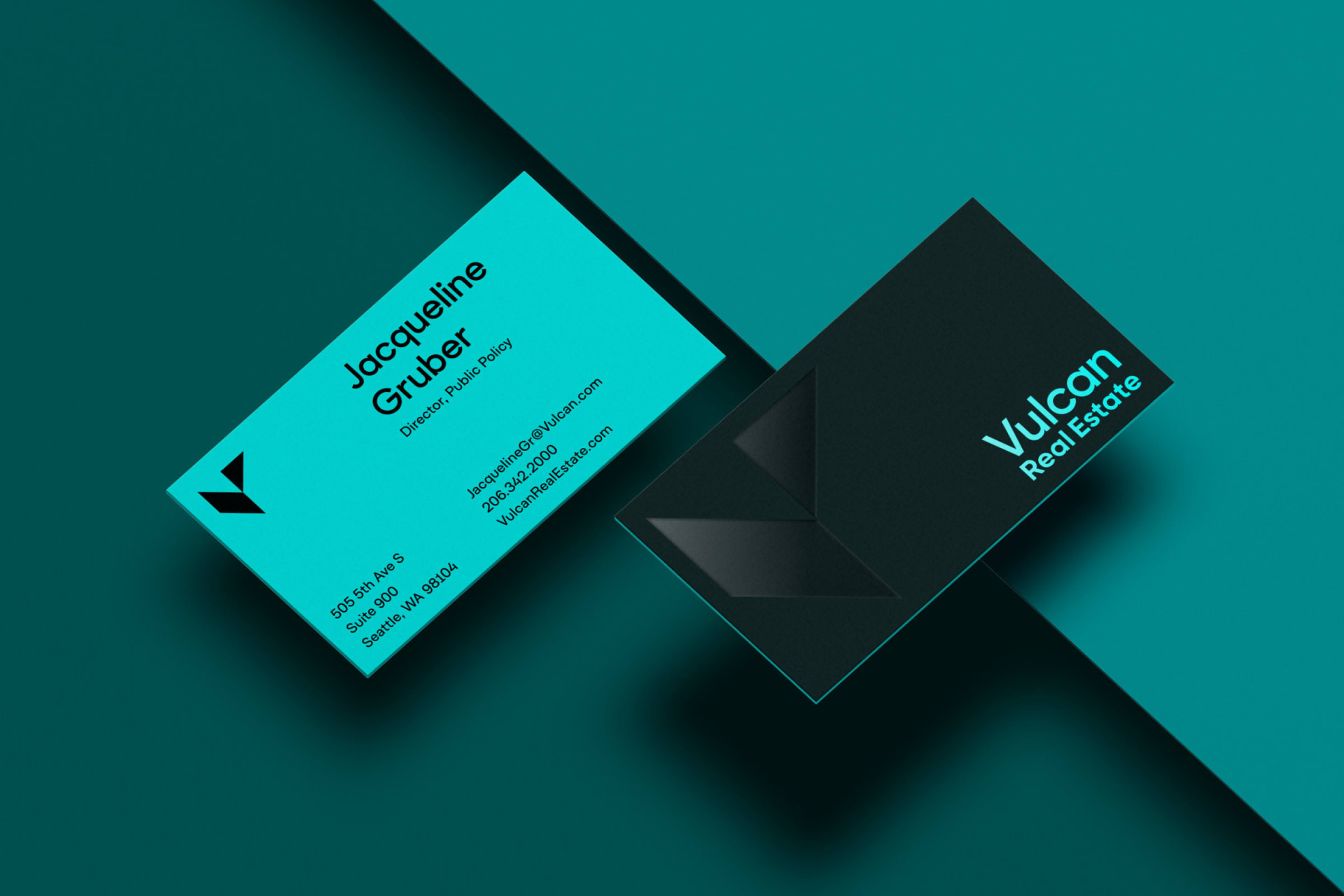
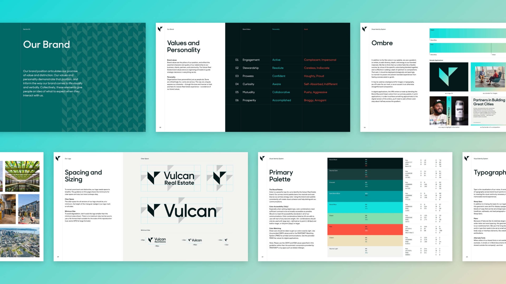
Vulcan Real Estate wanted to reintroduce themselves to the world in a big way — to step boldly forward into the future, but without abandoning their past. The new logo references the formal language of their legacy mark, but pushes them in a new, more modern and iconic direction. In it’s angularity, the mark creates an implied dimensionality, emphasizing their focus on physical infrastructure. Its downward directionality represents their practice of grounding their strategy in research, data, and analysis. More obviously, it serves as an abstract monogram.
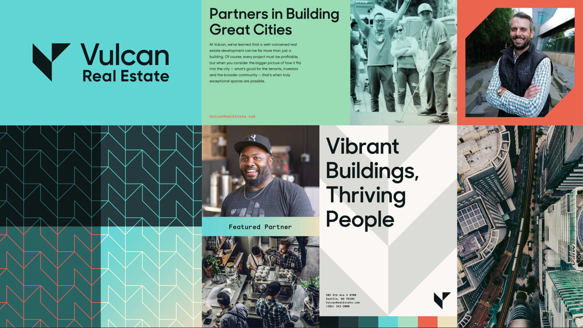
Building on the formal language of the new logo, we developed a comprehensive visual language for Vulcan that balances the precision of geometric shapes with a vibrant and optimistic color palette.
Discovery and User Experience
With any web project, our primary goal is to understand why we were hired in the first place. We worked closely with the team at Vulcan to articulate their needs, wants, and dreams for the site using a variety of tactics:
- Stakeholder surveys/interviews: we spoke with members of the client teams to better understand their goals and motivations for the project as well as their frustrations with their current site.
- Affinity Mapping: we analyzed and organized the feedback received from stakeholder interviews and surveys to identify common themes.
- Card sorting: as an exercise with the client team, we identified and ranked key audiences and purposes for the new site.
- Information Architecture: based on finding from discovery and our own analysis of their current site, we rearchitected their website from first principles.
- Low-Fidelity Prototyping: we tested our stuctural recommendations with the client in a low-commitment form to identify holes and correct bad assumptions.
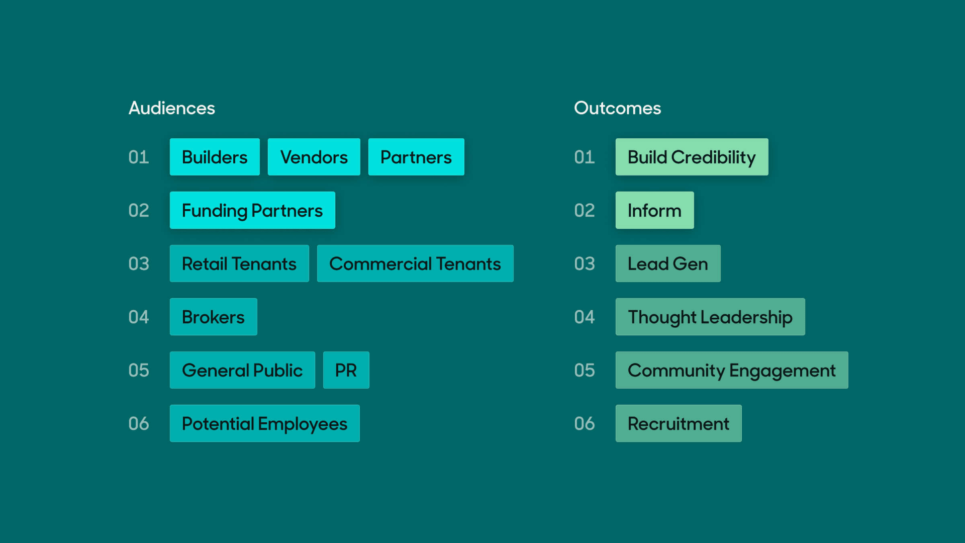
Card sorting results identifying primary audiences and outcomes for the website
From Identity to Design System
With any greenfield digital project, a big part of the initial visual design work is figuring out how to translate a generalized set of identity guidelines into a purpose-built, composable, scalable design system. Once we honed in on a design direction, we established a modular set of tokens and components in Figma to set us up for success as moved into extending the design system to the site at large.
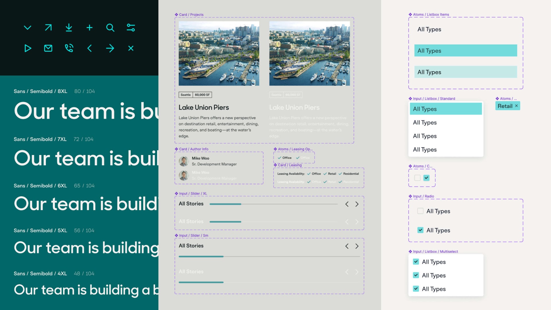
An overview of various modules from the design system
Video walkthrough of a Figma component API
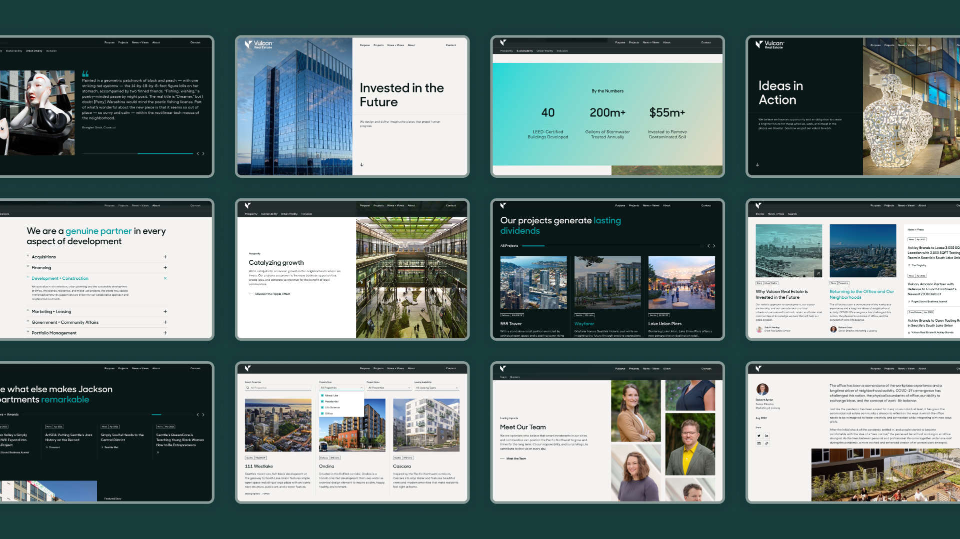
Overview of various modules from the Vulcan design system
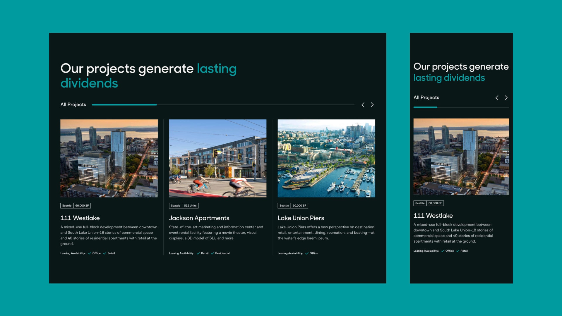
Responsive studies for the Content Slider module
Starting with Why
Based on our branding and discovery work, we identified etablishing trust and credibility as one of the primary functions of the site. One surefire way to do that is with a large portfolio of successful project work. But that’s table stakes — a lot of developers have nice-looking portfolios.
In order to give Vulcan's work context and meaning, we decided to increase the emphasis on the mission and purpose behind their work. We helped them identify four ways in which their projects create impact — prosperity, sustainability, urban vitality, and inclusion — and added a dedicated section to the site to showcase the ways in which these values influence and infuse their work.
Purpose index page introducing Vulcan's four values
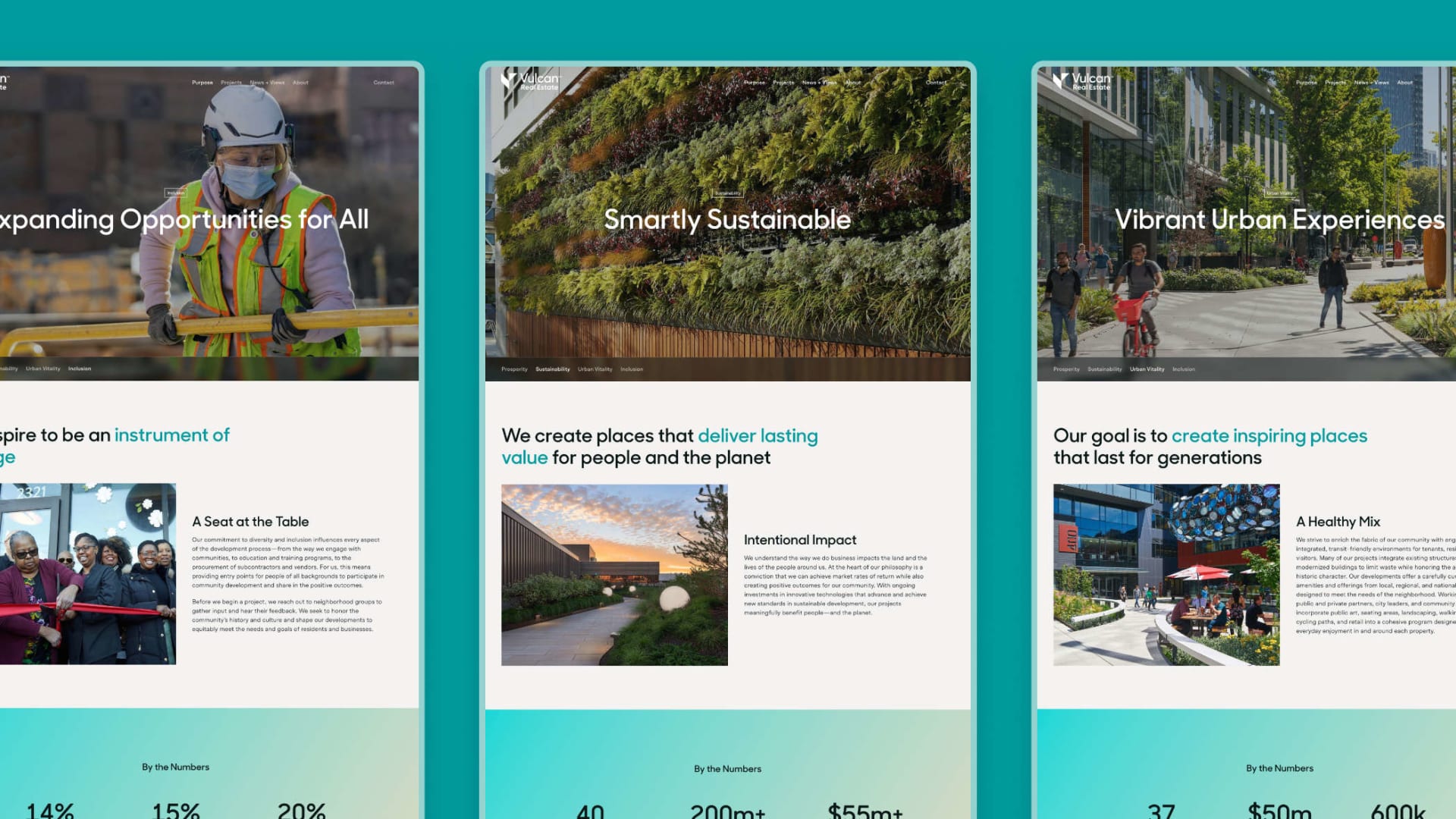
Variations of the purpose template for inclusion, sustainability, and urban vitality
Art for Everyone
In addition to the main Vulcan Real Estate site, we also built a microsite celebrating Vulcan's commitment to public art. The Virtual Artwalk collects every installation, mural, and other various artworks that Vulcan has commissioned for one of it's buildings over the last two decades into a explorable digital exprience.
There are two ways to explore the artworks: gallery view and map view. Because of engineering/resource constraints, we needed to build the views as separate pages. However, we were able to use one of my favorite techniques for making websites feel more app-like: intercepting routes. When a user clicks to view an artwork, we update the address in the url bar. Instead of doing a full-page refresh, though, we load the content for that page in a modal. This has the benefit of making the experience feel more seemless, but also allows for direct linking to individual artworks.
Intercepting routes on the Vulcan Virtual Artwalk microsite
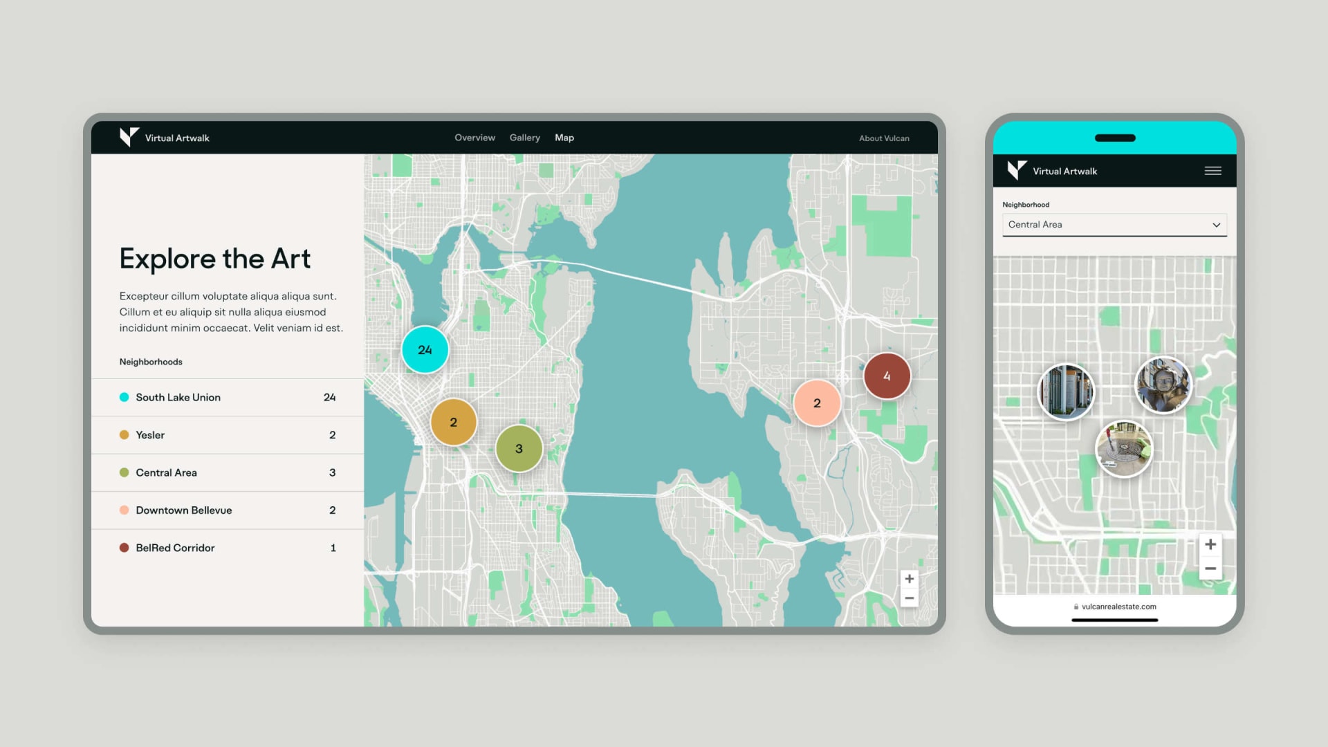
Map view of the Vulcan Virtual Artwalk
Reflections and Learnings
I love projects like this, where I am able to be involved from end-to-end and can help develop holistic solutions to wide-ranging. This one in particular allowed me to flex my full range of skills and experiences: identity design, UX/UI, prototyping, motion, front-end development, icon design, QA testing, project management, presentation, and more.
One thing I'm constantly trying to improve with projects as big as this one, though, is how to make the process more efficient. In a perfect world, we would be able to parallelize work so that phases that are not dependent of each other could be worked on at the same time without issue. People are messy, though, and timeline don't always hold. I'm excited to think more about tools and processes that could be put in place to help stakeholders on all sides of the project stay engaged and on track.
