Teague
Design Refined
Scope: UI/UX, Design System
Role: Design Director, Lead Designer
Year: Q1-2 2023
Agency: Turnstyle
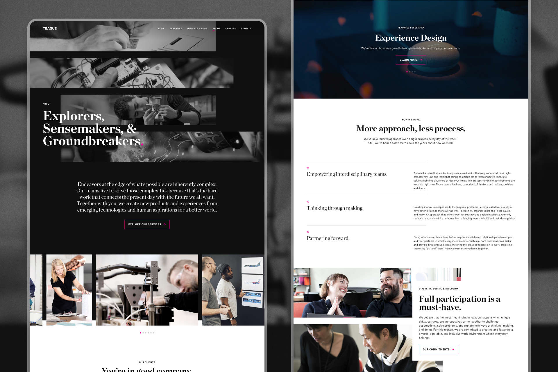
Teague is a design and innovation company that combines technological expertise with a deep understanding of human behavior. Back in 2019, as one of my first big projects at Turnstyle, we worked with their team to design and build a bespoke digital experience to promote their philosophy, portfolio, and approach.
By 2023, the site was starting to show it's age. Working closely with team at Teague, we set out to evolve and streamline the design system and CMS we built years prior to remove cruft and make it more flexible, scalable, and future-proof.
Home hero for the redesigned Teague website
Defining the Problem
Collaborating with our development team, we worked to uncover the scope and scale of the problem through a series of exercises and audits:
- Stakeholder interviews to identify specific pain points authors have when using the CMS.
- UX/UI/accessibility audit to identify opportunities to streamline the front-end design system and user experience
- CMS Audit to identify opportunities to simplify and supercharge the back-end author experience.
A snapshot of the CMS/site audit, completed by developer R.J. LaCount
In the course of our research, we discovered a few, specific issues that were the primary causes of the team's problems:
- Technical Debt: After years of wear and tear and several rounds of piecemeal updates, Teague's website had become bloated and difficult to manage, particularly from an author experience standpoint.
- Design Debt: Shortcomings and oversights in the original design system made adding new pages to and reorganizing modules on the site unnecessarily difficult.
- Obsolescence: The site's Content Management System was showing its age. Rebuilding the CMS from the ground up would allow us to take advantage of new technology to greatly improve the experience of maintaining the website.
Refining the Design System
These issues warranted two distinct strategies for the front- and back-ends of the site. Whereas the issues with the back-end meant we would need to rebuild it from the ground up, the front-end of the site warranted a more evolutionary approach. Some of our goals for the redesign included:
- Leveraging new tools and strategies to make our approach to design more rational, scalable, and consistent.
- Identifying the full range of states and contexts individual modules may have to ensure we are designing for all possible needs and use cases.
- Fixing user and author experience issues without making the site feel generic or cookie-cutter.
We used Teague's logo mark — a stack of four asymmetrical, magenta speed lines — as the starting point for our design system. As simple as it may be, the asymmetry, sense of motion, and vibrancy inherent to the logo became the foundation of many of our design decisions — from styling and layout to animation and interactivity.
Loading animation and hover style inspired by Teague's logo mark
A selection of expressive layouts inspired by Teague's logo mark
While we were careful not to neutralize Teague’s brand voice in the process, our primary goal for the project was to redesign the system to be as functional and composable as it is expressive. In addition to finding places to amplify and reinforces Teague's brand, we developed a comprehensive set of workhorse modules, which make up the bulk of the site.
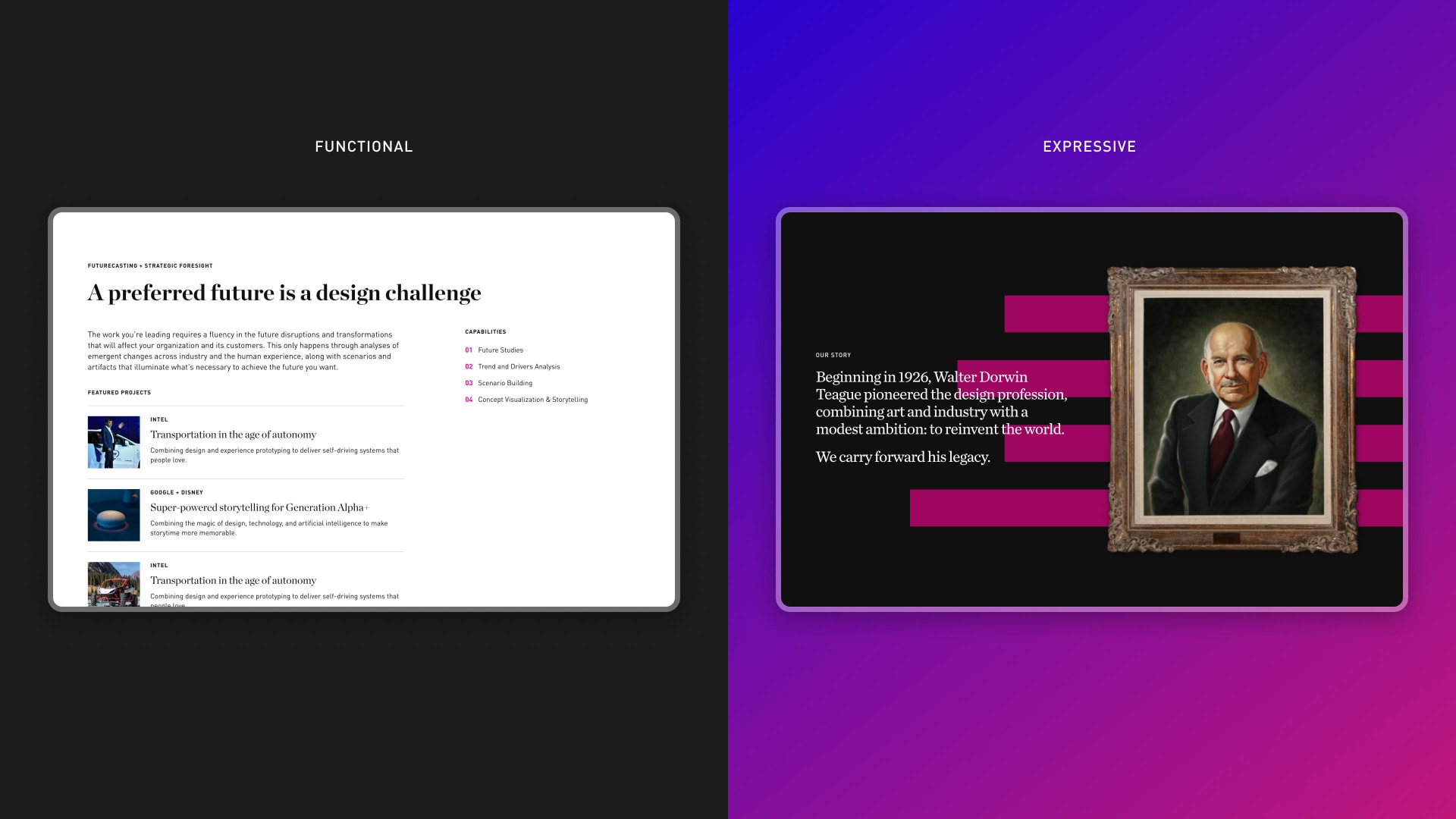
Balancing scalability and expressiveness in the design system
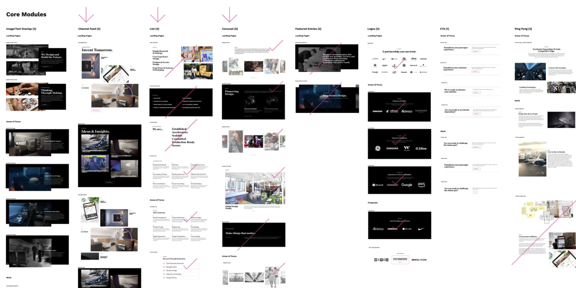
Balancing the need for the site to be both functional and expressive, we even in some instances built display options into modules to allow them to either be more simple and understated or more bold and expressive.
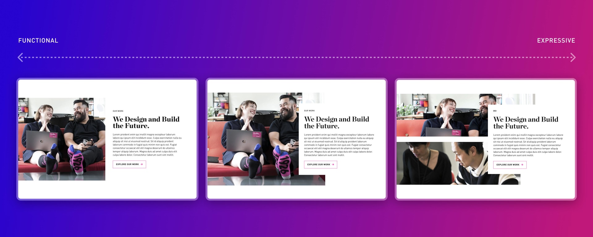
Display options for a module ranging from more functional to more expressive
While we weren’t totally redesigning the system from an aesthetic standpoint, we did take the opportunity to overhaul our approach to implementation. We leveraged Figma’s native features to establish a modular, scalable set of styles and components to serve as the foundation for our system.
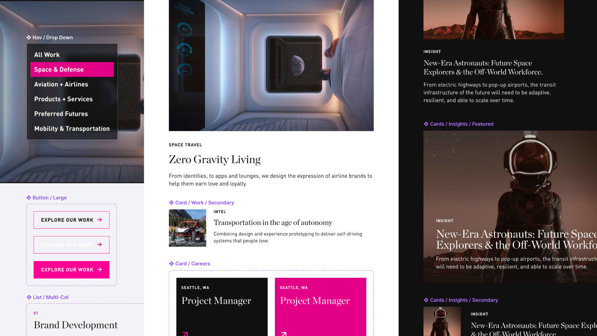
A snapshot of some of our Figma components
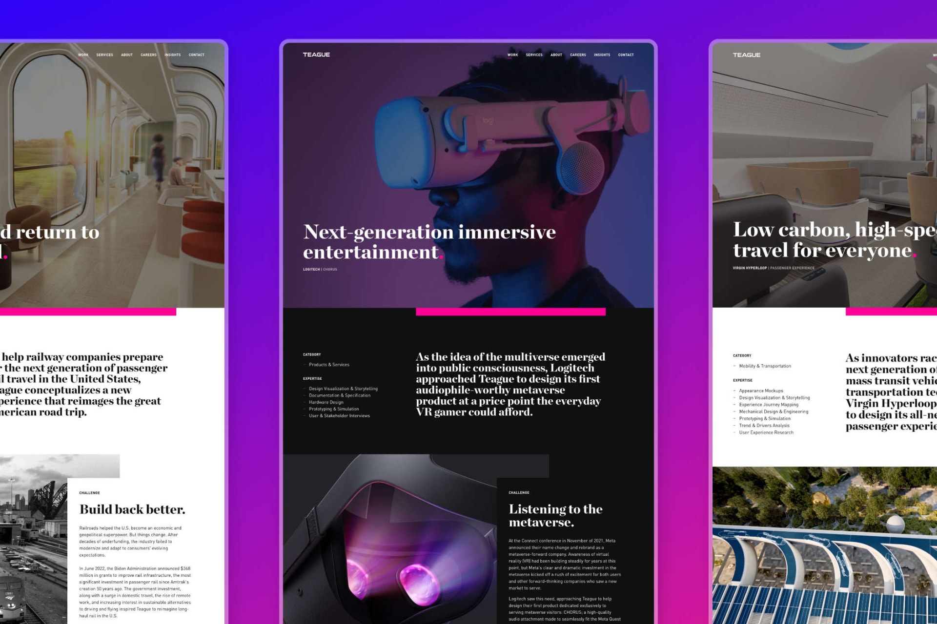
After establishing a core set of patterns and styles, we rolled out the refined design system across the site. In collaboration with the team at Teague, we worked to streamline the CMS, making sure that each module we added served a purpose and fulfilled a need.
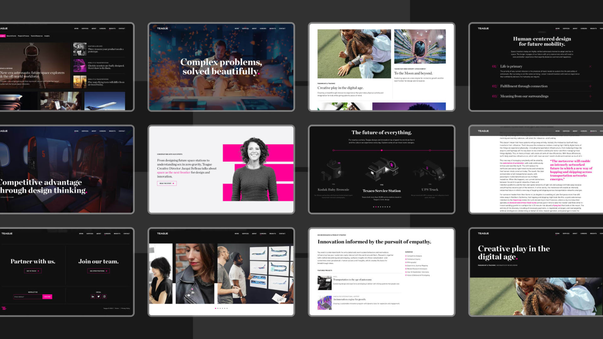
On overview of various modules on the site
And of course, everything from layout to interaction needed to work responsively and provide a compelling experience regardless of where and how the site is viewed.
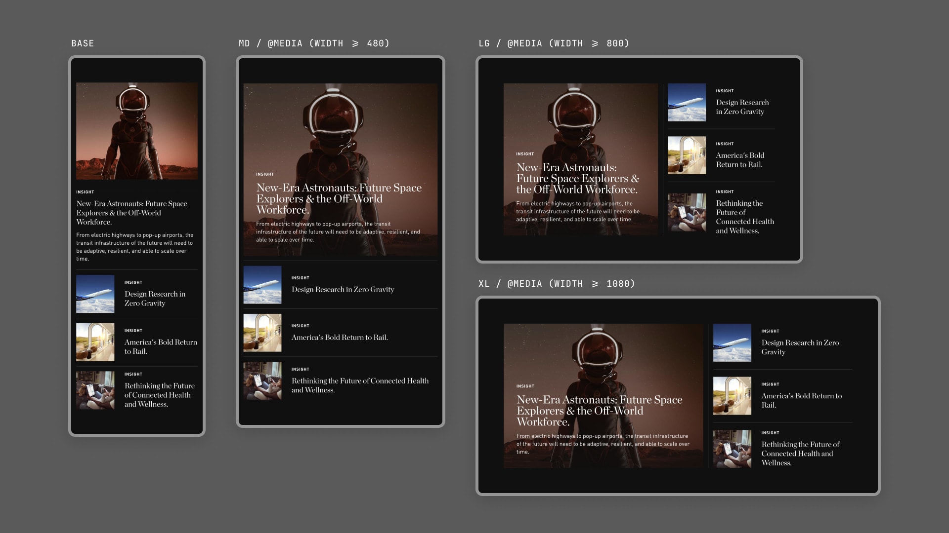
Responsive studies for the insights hero module
Mobile layouts and interactions
I'm passionate about bridging the gap between design and development through my work and collaborating closely with engineering teams to define a shared language and process. As I build out a design system in Figma, I work closely with development to make sure our respective environments are tightly aligned.
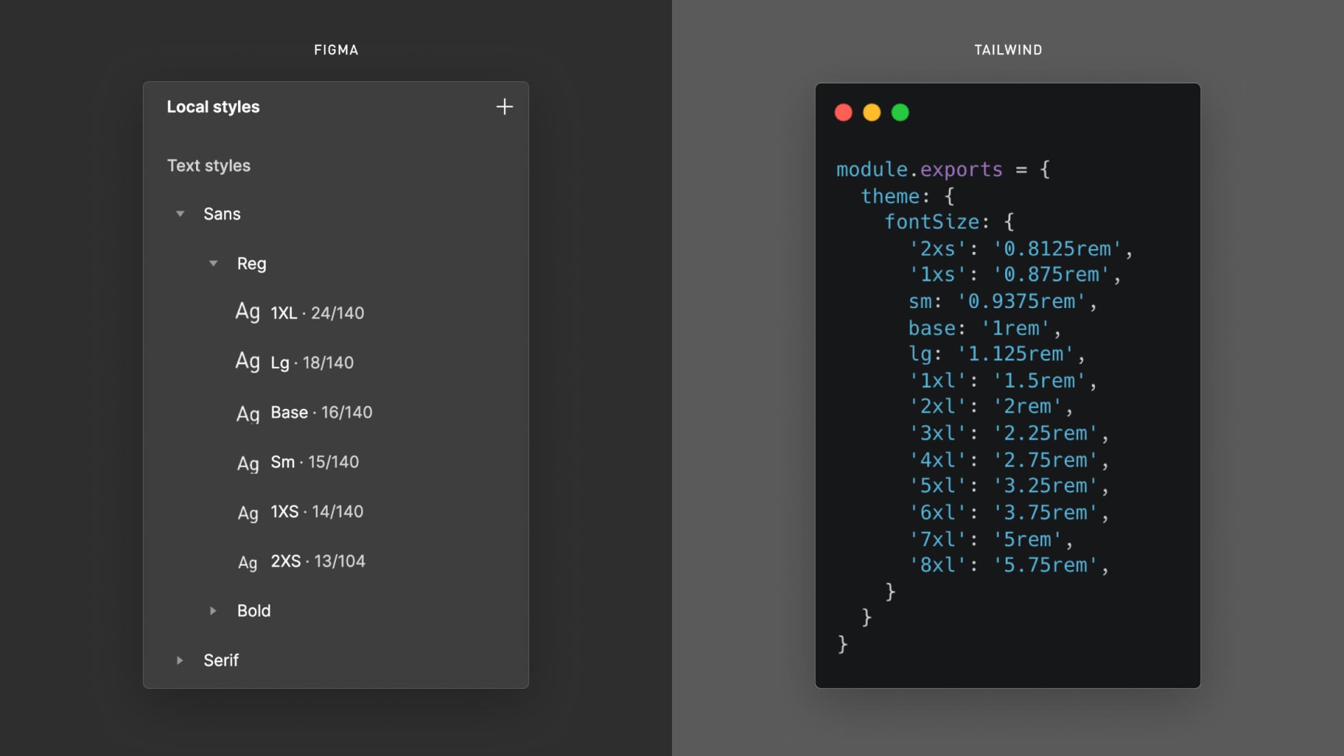
Design tokens in Figma and Tailwind CSS
Redefining the Author Experience
One of the primary drivers for this project — and an underappreciated part of building maintainable websites in general — was the need for a more efficient, intuitive author experience. Rather than pulling in a bloated, off-the-shelf solution, we leveraged Craft CMS as the foundation for a highly-customized CMS capable of mirroring the design and performance integrity of the site's front-end.
Each CMS is unique, but there are a few heuristics that we leverage when building a new system.
Do It for Me
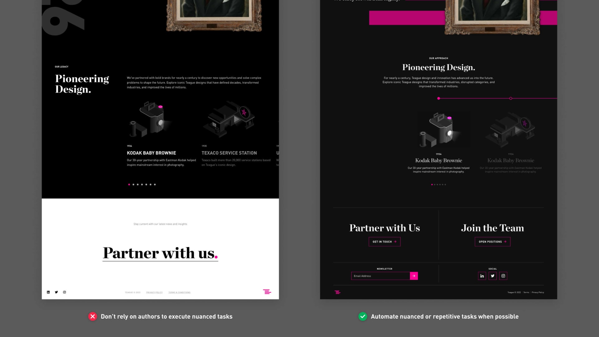
Don’t force users to act like computers. Instead, increase the resiliency of your system by looking for ways to automate repetitive or nuanced tasks.
For example, we made the decision that the footer should always be the same color as the module before it. In practice, that means the footer will be one of three colors — white, light gray, or black — and that its color will change from page to page.
In the original build of the site, we made this a manual task, which meant that the footer was, more often than not, the wrong color. The task was too nuanced for most authors to remember. In the new build, we automated this process so that if the color of the last module on a page is changed in the CMS, the footer color will automatically update as well.
Rightsize Complexity
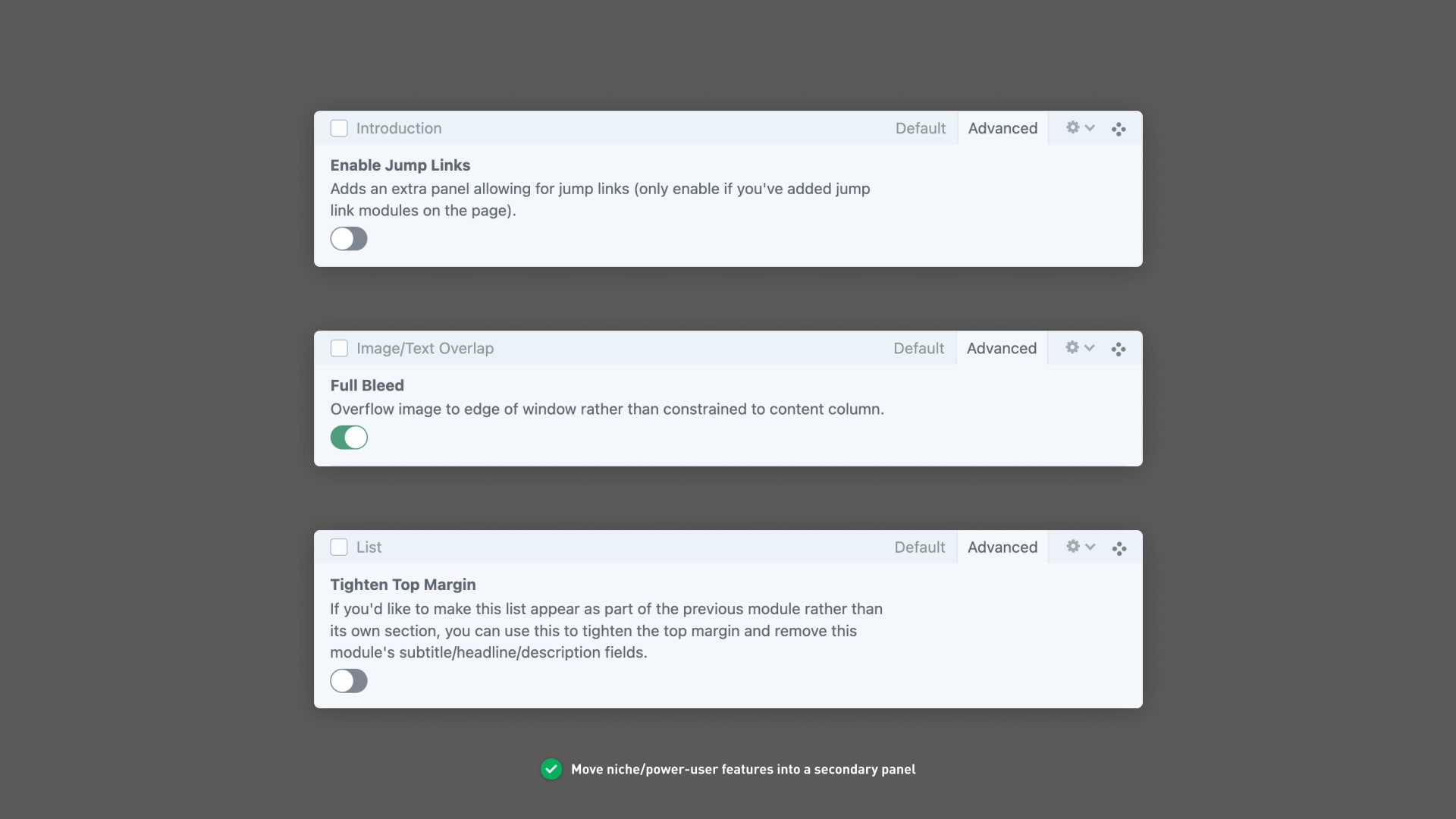
Don't make it do everything — focus on making your CMS clear and approachable rather than comprehensive. Just because you can give authors the ability to do something doesn't mean you should.
Instead, manage complexity by establishing a baseline for the level of nuance and flexibility a client wants, and use testing and research to determine if additional options/functionality are actually useful and desired. Alternatively, you can keep the primary interface of a module tidy by moving niche/power-user features into a secondary tab.
Set an Intentional Pace for Decision-Making
Don't paralyze users with a paradox of choice. Instead, look for ways to establish a consistent pace and rhythm for decision-making and avoid overloading users with all of the options up front.
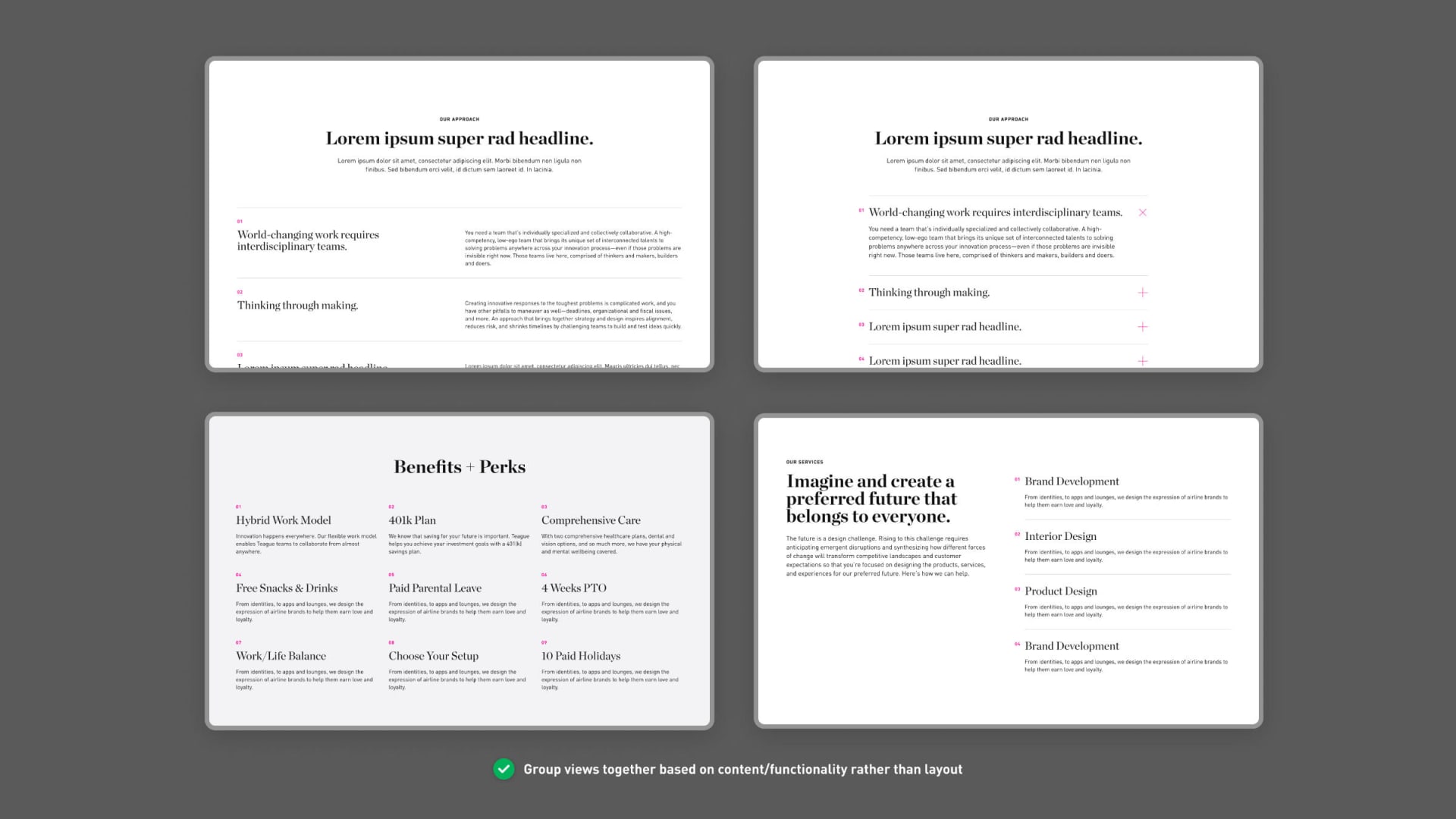
When it comes to organizing and defining module sets, for example, grouping views together based on content/functionality can help reduce the perceived number of options a user has up front and establish a better pacing/rhythm for decision-making.
Each of the following modules are essentially different views of the same content, which are useful in different contexts. Previously, we might have built these as multiple separate modules, overwhelming authors with the total number of available options. Now, we err on the side of less top-level modules by making these variations of a single module.
Reflections and Learnings
This was an exciting project because it allowed me to revisit a past design system, understand its shortcomings, and reimagine it from first principles. I found it rewarding to have the opportunity to dive deep on our clients' pain points, analyze how our past design decisions contributed to those frustrations, and iterate on solutions without tearing down the system and starting over.