Cipher News
Designing the News

Scope: Product Design, Design System
Role: Design Director, Lead Designer
Year: Q1-2 2023
Cipher is a publication covering climate change and the global transition to net-zero. As an offshoot of Breakthrough Energy—a network of investment vehicles, philanthropic programs, and policy advocacy activities focused on accelerating this transition—the Cipher team prioritizes, above all, being a high-quality and credible source of information in a rapidly-evolving ecosystem.
Based on our work establishing their brand and visual identity guidelines, the Cipher team wanted to collaborate with us to expand their visual identity to a web-native design system and build a bespoke digital experience for their content.
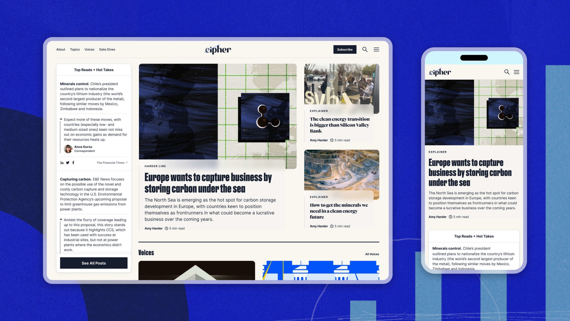
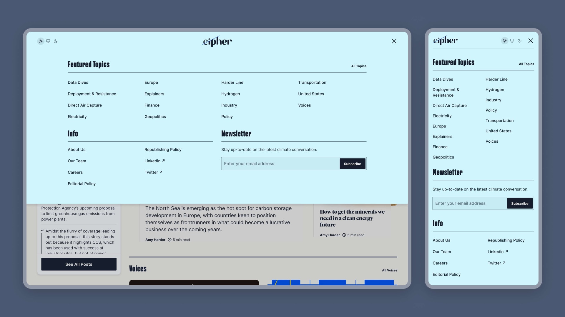
Home screen for the redesigned Cipher website
Strategy + User Experience
Based on the dynamic, content-heavy nature of the product, the bulk of our early work centered around defining a model for the site’s user experience. Working closely with the Cipher and Breakthrough Energy teams, our primary goals for this phase of the project included: codifying the site's information architecture and navigational model; developing a structure for organizing and categorizing their content; and to understanding the breadth of modules/patterns required for the site.
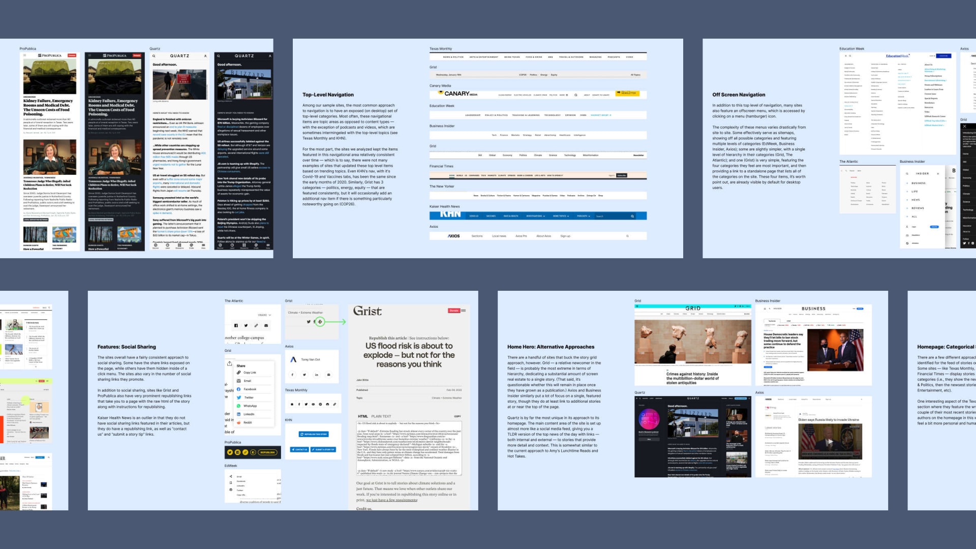
Competitive analysis assessing common patterns and conventions
Specific deliverables from this phase included:
- Stakeholder Interviews: We spoke with members of the client teams to better understand their goals and motivations for the project. This provided us with a solid foundation on which to begin to build and test our assumptions.
- Competitive Analysis: we dove deep on the product design of other news organizations—both within and outside of the climate space—to familiarize ourselves with the competitive landscape and seek out inspiration and opportunity.
- Site Map: based on our initial conversations and interviews with the teams, we built a site map to visualize the high-level structure and organization of pages and help us define the scope of work for the site.
- Low-Fidelity Prototype: we developed wireframes for all pages and templates on the site to begin to tease out necessary design patterns and approaches.
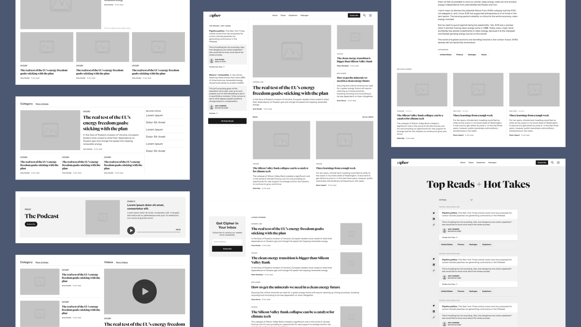
Wireframes for various pages and modules on the site
Navigation
Early in the process, we focused on defining the site’s navigational model — a feature which would also help us better understand how stories should be categorized across the site. We tested three options with the team, which each took a distinct approach to promoting categories and guiding users through the content.
- Curated: this direction requires Cipher to identify a finite number of categories that would be elevated above all others. This is by far the most opinionated approach, but has the benefits of giving users clear entry points into the content and also sends a signal about Cipher’s areas of focus.
- Segmented: this direction is less heavy-handed than the first, but does create distinction and hierarchy between two types of categories: topic and content type. Especially with regard to topics, though, it still takes a less-is-more approach.
- Flat: this direction is the most open-ended in terms of organization and hierarchy, combining topic and content type together and being less restrictive in terms of the number categories displayed. Based on our research, this was the most common approach among other news outlets.
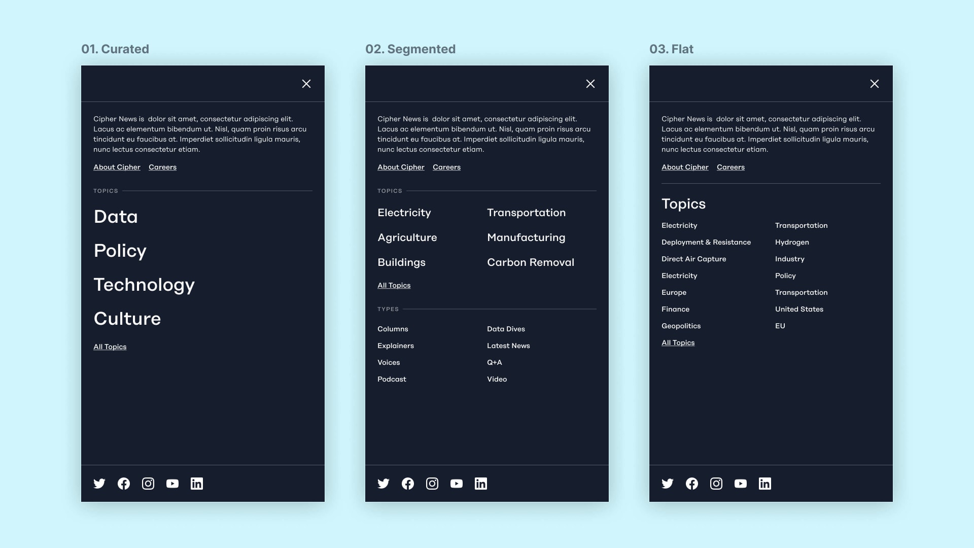
Three distinct approaches for the site's primary navigation
Based on testing and conversations with the client teams, we determined that the third direction would be the most maintainable and meaningful. Cipher’s stories are cross-cutting, and trying to organize them into separate, distinct categories had the effect of creating arbitrary and often false dichotomies.
Final navigation design at small and large breakpoints
Design System
Rather than rotely translating their existing brand to a new medium, we used the development of the Cipher News design system as a way to push and evolve their visual identity. Leveraging Figma's native features, we established a set of reusable styles and components able to adapt to their context in a layout as well as the state of the application as a whole.
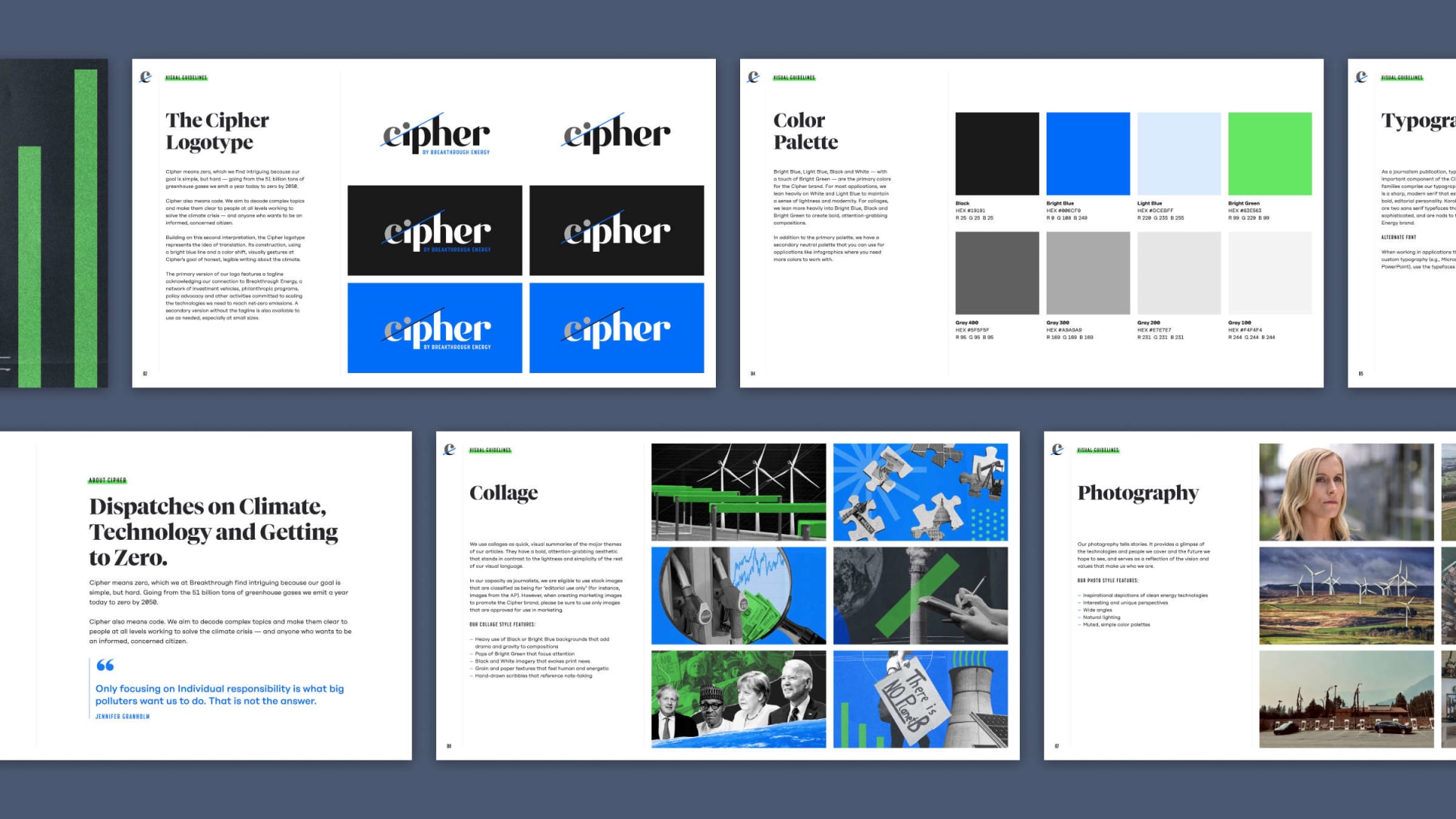
Original brand identity guidelines for Cipher, designed in 2021
Putting the time and effort in up front to define a high-level system for the site was critical to the success of the project. It set us up to move more quickly and design with a higher degree of consistency and fidelity than would otherwise have been possible. It allowed us to prioritize accessibility, ensuring that all colors meet WCAG AA guidelines. And it ensured that all designs implemented based on our established patterns and practices would satisfy our stated goals and requirements and align with our development approach.
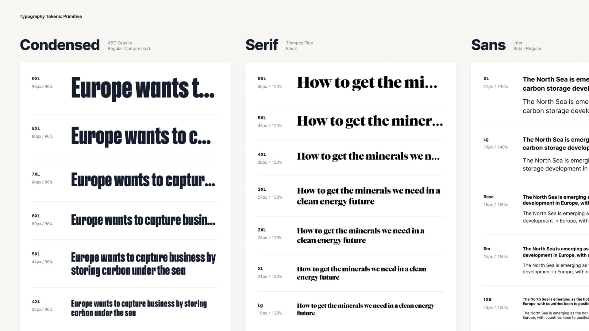
Primitive typographic design tokens
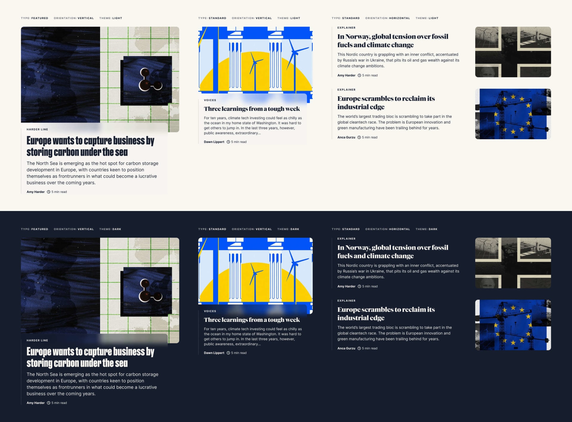
Card component variants
Home Screen: Balancing Priorities
Operating with a relatively small team of journalists, Cipher prioritizes the quality and depth of their content over the quantity of articles they publish—producing several feature-length articles per week, not per day. That said, they also recognize the need to consistently publish new, compelling content everyday to keep readers coming back.
With those two competing priorities in mind, we created a special type of post: the Quick Post, or what I like to think of as "tweeting to the homepage." Quick Posts (also known by their external name, “Quick Reads and Hot Takes”) are short-form content that provide commentary and context on articles from other news organizations. They enabled us to feature frequently updated content at the top of the homepage without stealing the spotlight from Cipher's longer-form articles.
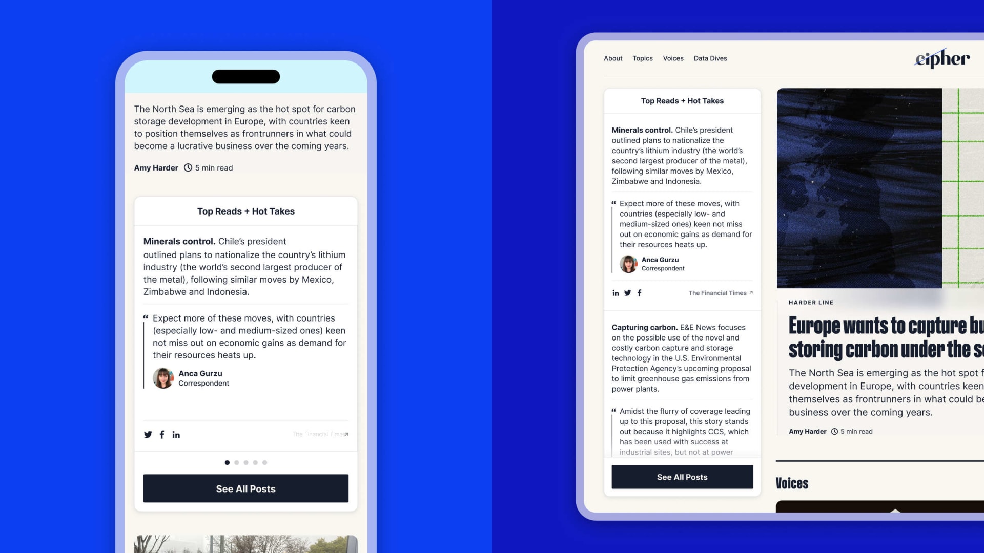
Final homepage Quick Post module at small and large breakpoints
For Cipher correspondents, Quick Posts provide a relatively low-effort way to publish frequently without disrupting their larger journalistic efforts. For Cipher readers, they provide a new way to stay up-to-date with what the Cipher team is reading and thinking about and create incentive to regularly return to the site.
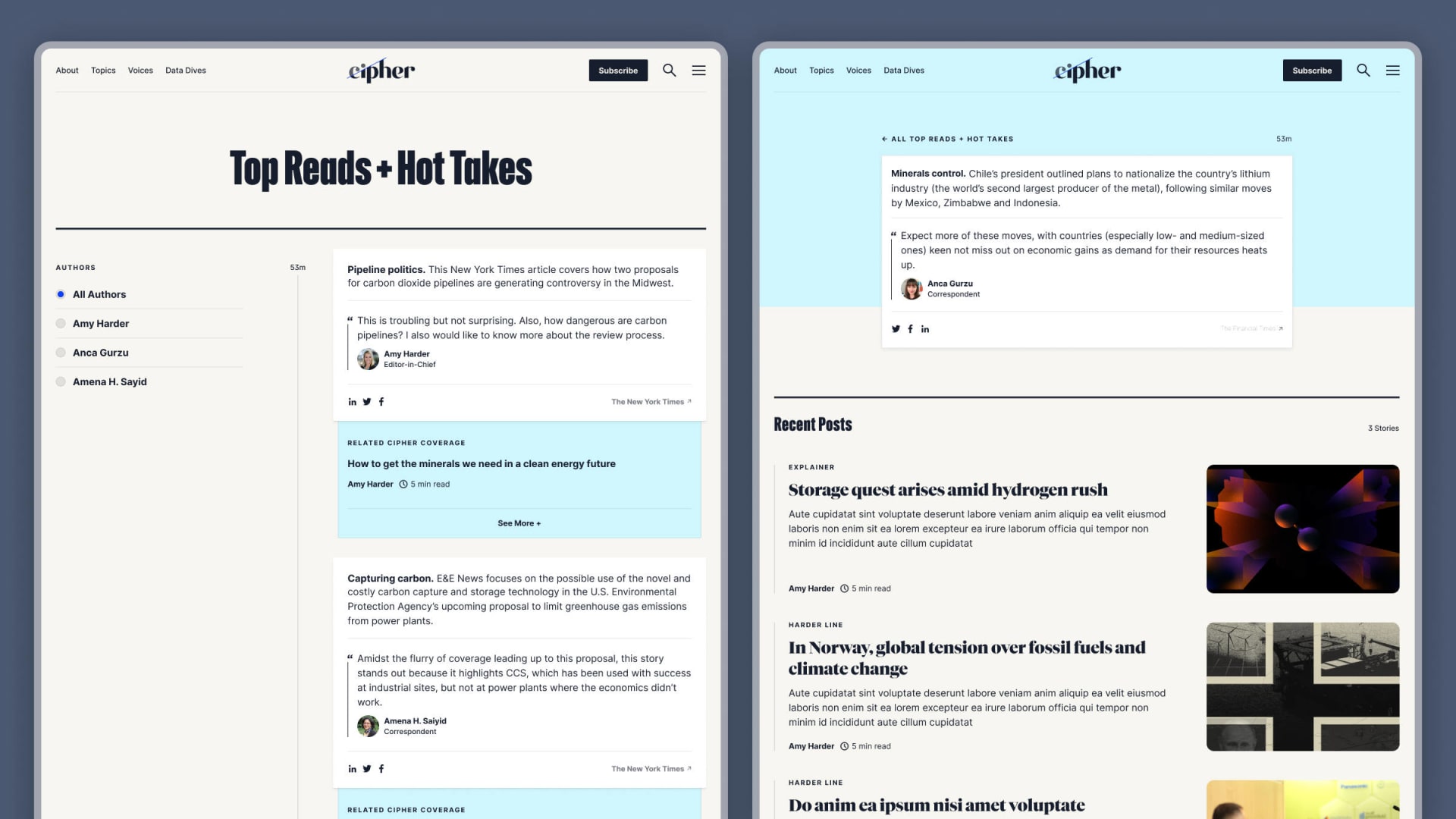
Quick Posts landing page and post template
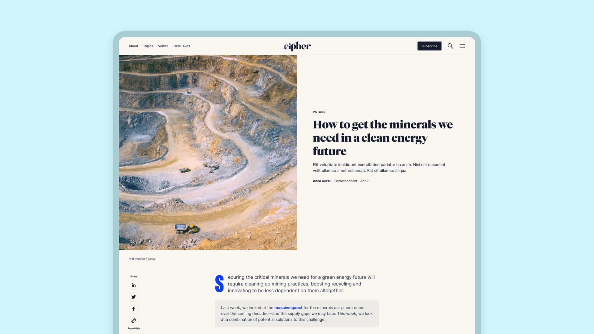
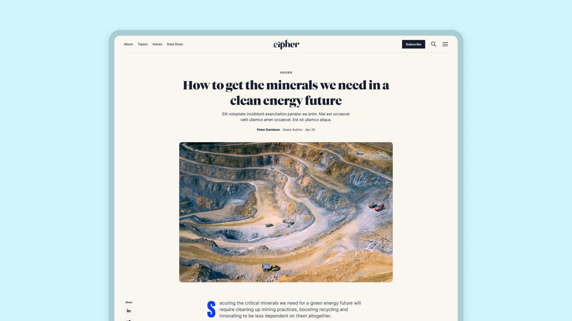
Article Template: a Workhorse Design Solution
Being a news publication, the article template forms the foundation for the vast majority of the pages on the Cipher website. As such, we prioritized understanding and anticipating the needs of authors to produce a template that is robust and flexible, capable of accommodating articles of any category or content structure.
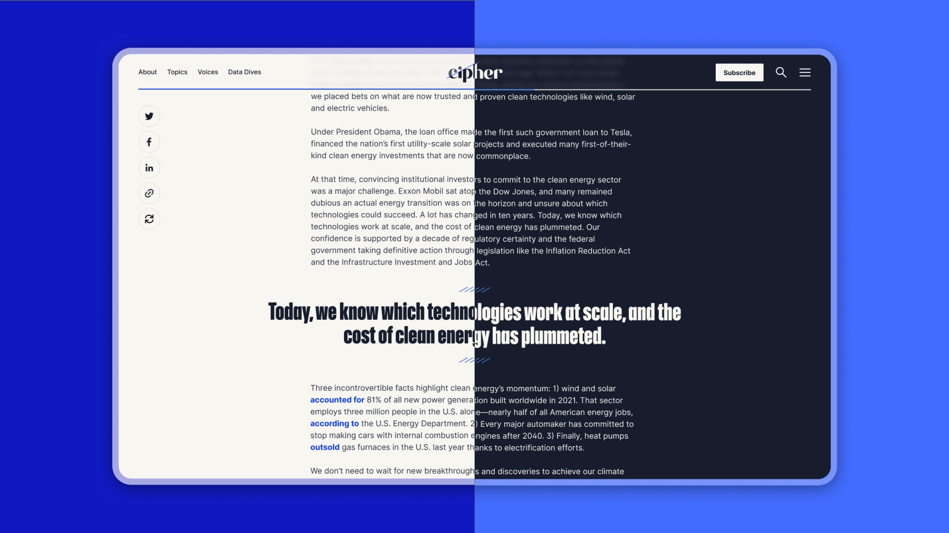
Article template in light and dark mode
Our specific goals for the article template included:
- Balancing the consistency of the overall experience with the varying needs of journalists and stories
- Differentiating between articles authored by Cipher correspondents and outside contributors
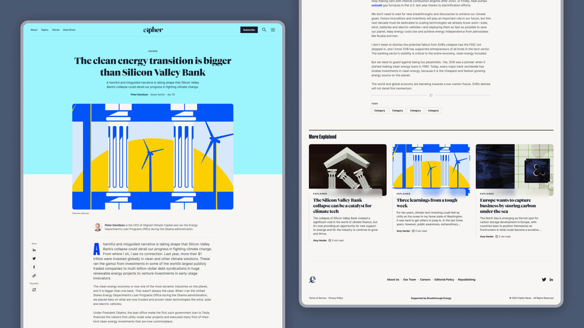
- Increasing site engagement by exposing readers to related content and categories
- Promoting the Cipher newsletter and offering a low-friction way for readers to subscribe
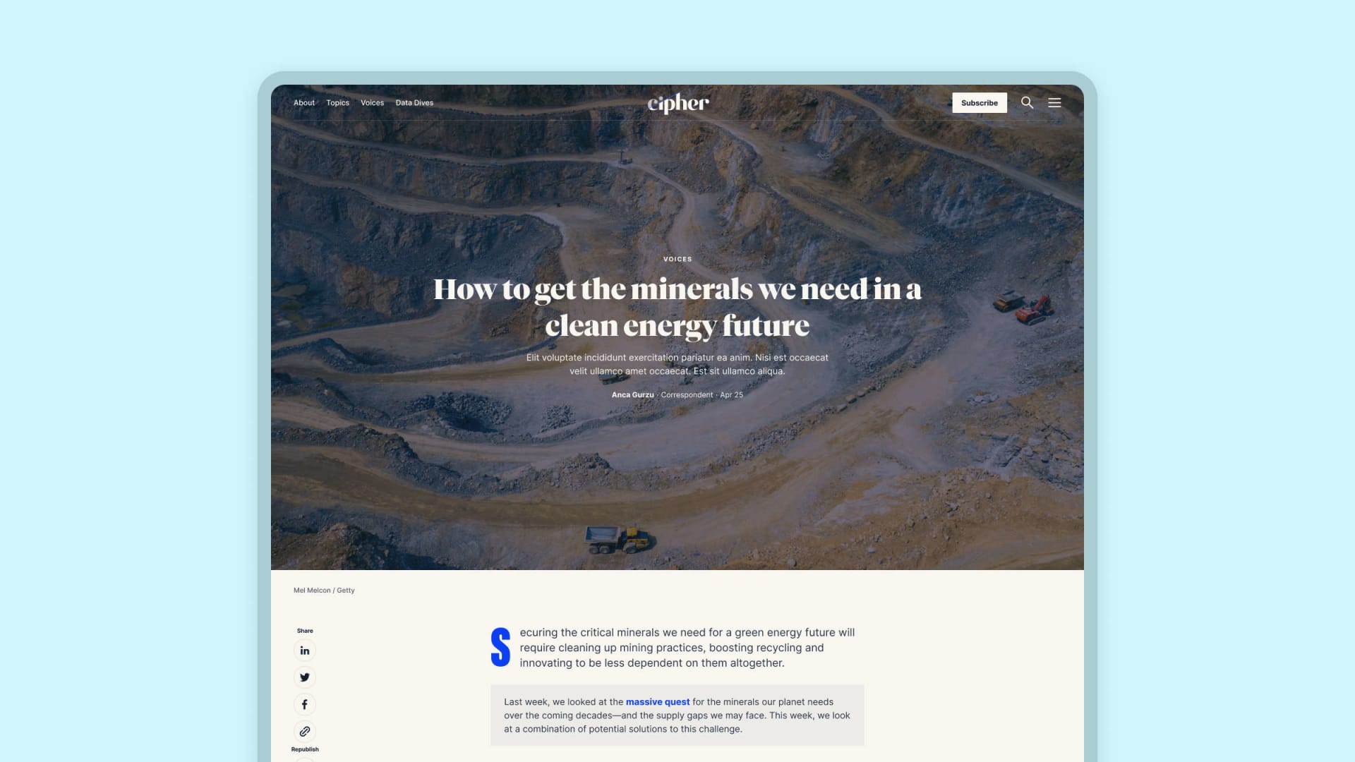
Hero layout variants for the article template
Hero and footer from the article template
Feature Prototyping: Validating Concepts
In addition to producing a prototype of the site as a whole, we dove deep on a set of features that we believed might cause roadblocks in development. To validate our ideas and clarify the user and/or author experience, we produced a set of high-fidelity prototypes—using a combination of Figma, live code, and After Effects—that offered specific recommendations for implementation and helped bridge the divide between design and development.
For example, on the About section of the site we leaned more heavily into a duotone photo style from the Cipher brand guidelines. On the Team page specifically, the Cipher team liked the idea transitioning from duotone to full-color photos of each team member on hover. Rather than requiring site authors to manually create the duotones and upload multiple versions of each photo, we developed a way to programmatically manipulate the photos using CSS blend modes.
This approach has the benefit of simultaneously aligning to Cipher's brand standards, simplifying the author experience of the CMS, and reducing the number of images on the site, thus speeding up the user experience.
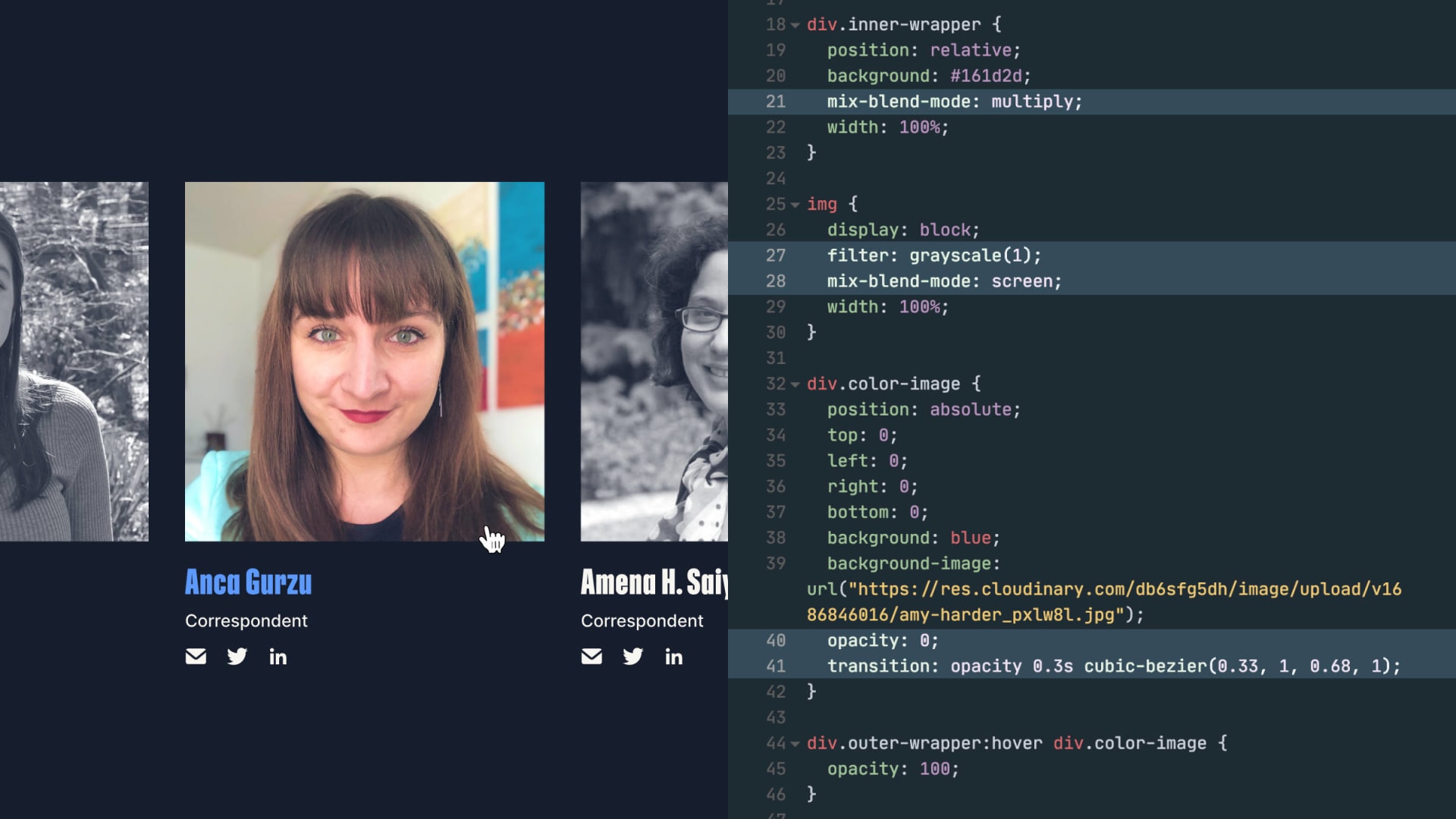
Implementation of hover state prototype
Reflections and Learnings
We wrapped up design on the Cipher site a week or two before the release of Figma variables, meaning that our approach to developing and scaling the design system for the site would be much different today than it was in early 2023.
One concrete example: dark mode. Implementing multiple themes in a system without relying on an external plugin was much more difficult than it needed to be, requiring us to maintain separate component instances for each theme. Now, with the ability to alias variables natively in Figma, this process becomes significantly simpler. Creating a semantic layer of variables on top of a system’s primitive variables that are able to update based on the state of the application means less components and, therefore, less design debt.
I'm excited to be able to leverage Figma variables in the future to create design systems that are complex enough to solve the problems of modern application development while also being simpler, more resilient, and more approachable than they were previously.