Carbon Direct
Built for Scale
Scope: Identity, Design System, UI/UX
Role: Lead Designer, Creative Developer
Year: 2022
Agency: Turnstyle
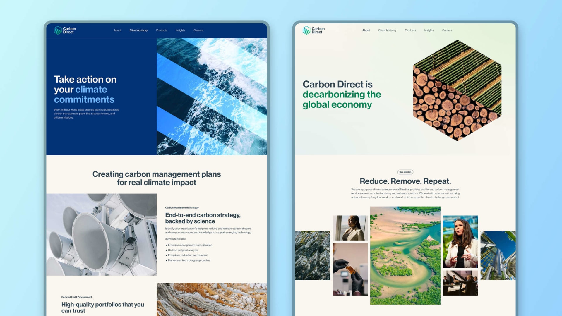
Carbon Direct is a purpose-driven carbon management firm enabling organizations to reduce, remove, and utilize their emissions. No longer a scrappy startup, they needed a new brand and digital presence that better communicated the scale and capabilities of their company and matched their approach to business — intelligent, dynamic, and distinctive.
Working closely with the team at Carbon Direct, we rebuilt their brand from the ground up to cement their standing at the forefront of a vital new industry. From initial UX and identity explorations to prototyping and development, I engaged with this project from end-to-end to make sure that what we proposed matched what we delivered.
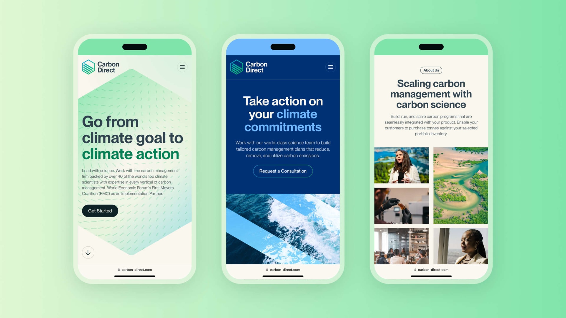
Mobile interactions on the redesigned Carbon Direct site
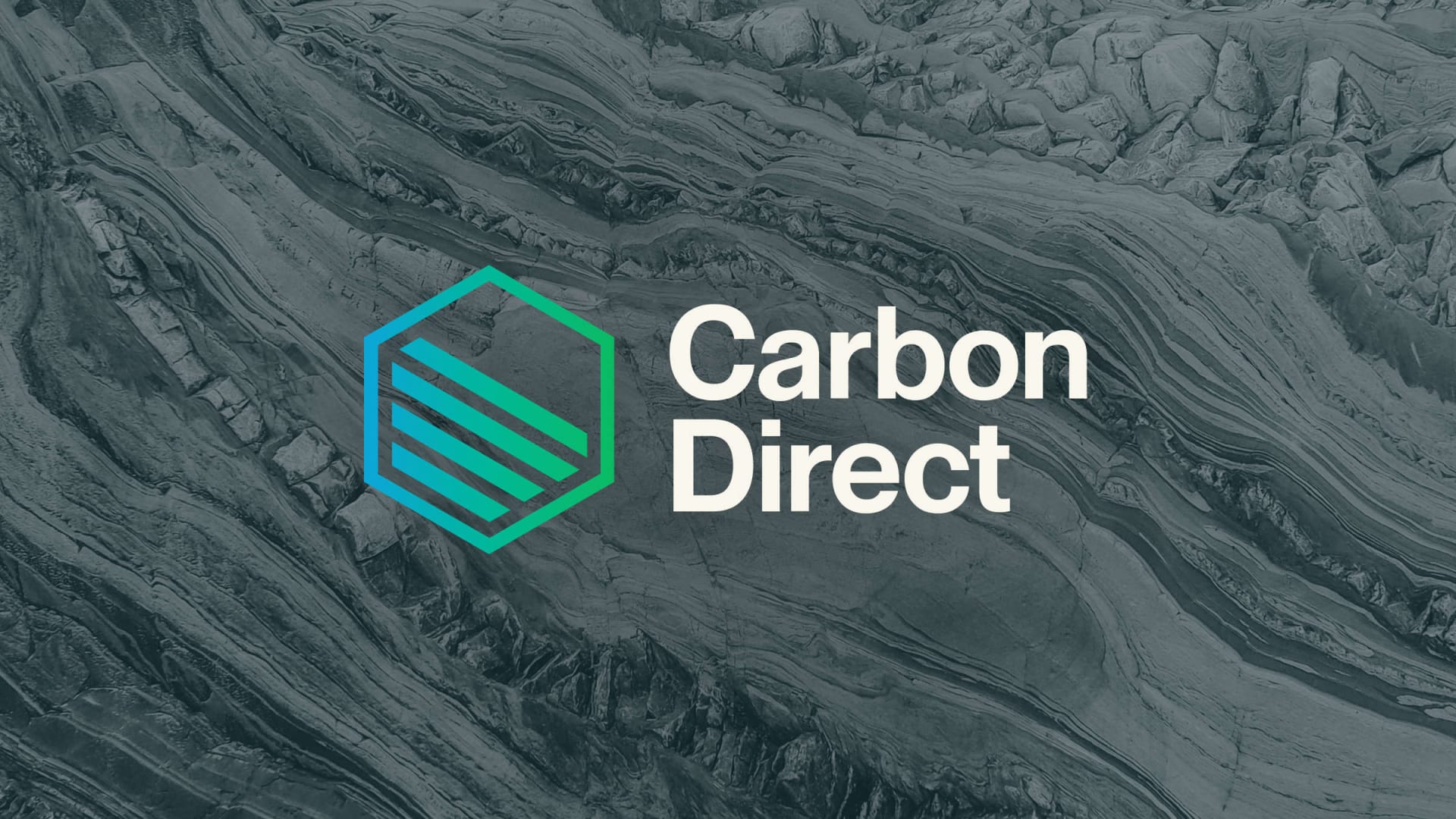
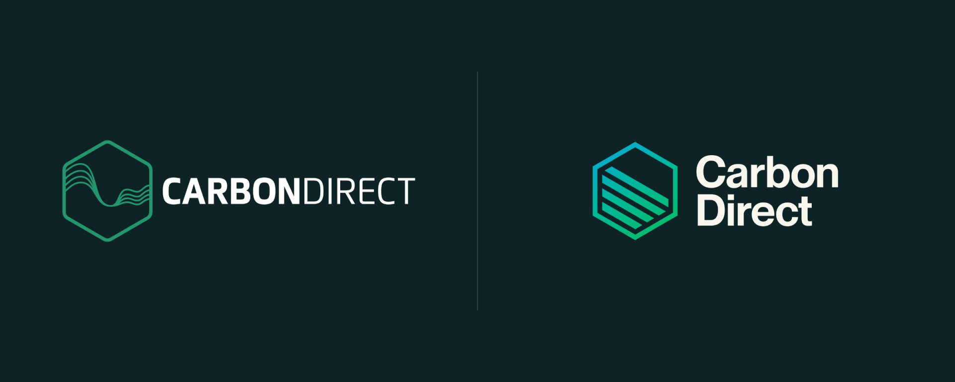
Evolving the Mark
We began by defining a general visual identity direction that could serve as the foundation for the rest of our work. After several rounds of exploration, we realized that the team at Carbon Direct preferred to maintain some connection to their previous identity rather than completely wiping the slate clean.
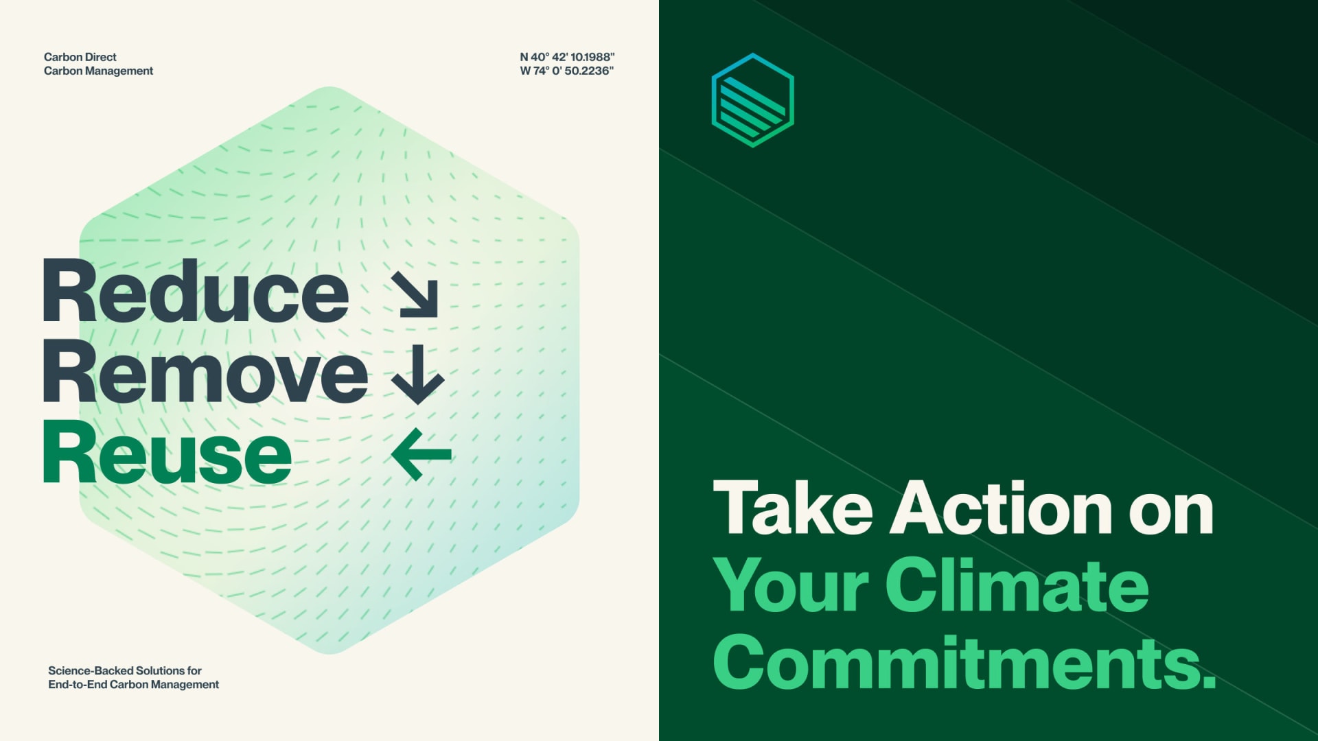
With that in mind, we evolved Carbon Direct’s logo to be more simple, memorable, and functional while still staying true to their founding story—highlighting multiple paths to decarbonization and emphasizing the necessity of carbon removal in our fight against climate change. The new color way, a vibrant blue-to-green gradient, symbolizes the optimism and pursuit of progress that is central to Carbon Direct’s work.

Designing for Scale
Unlike our approach to the logo, our visual identity work was more revolution than evolution. One interesting aspect of this project is that the product team at Carbon Direct planned to use our identity guidelines as the foundation for their work. From color and accessibility to typography and iconography, we needed to make sure that the system we developed was robust, flexible, and scalable enough to meet their team’s needs.
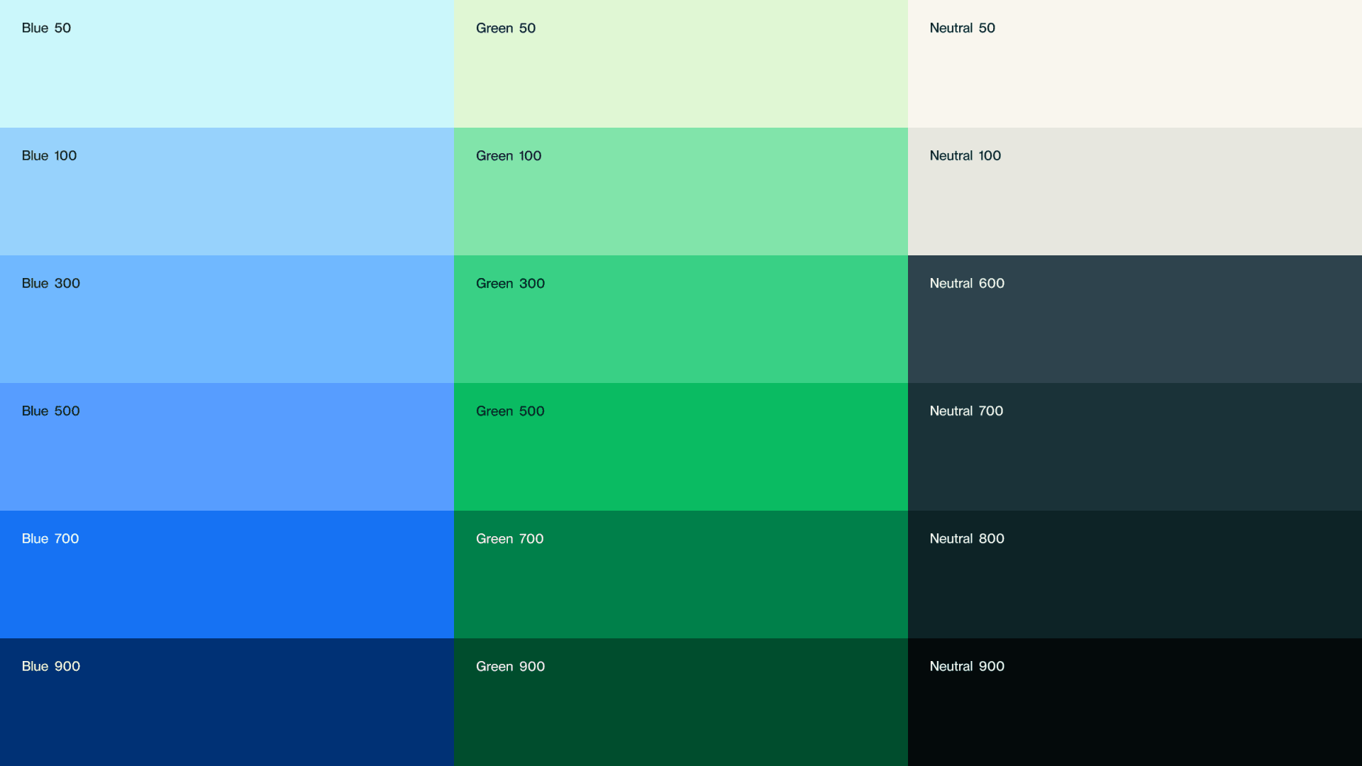
Primary color palette
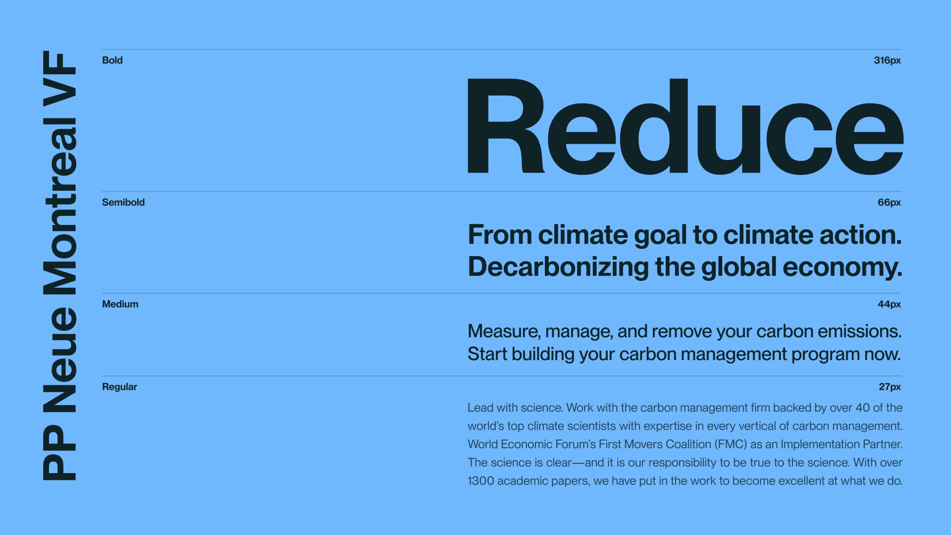
We selected a variable font family to balance flexibility and performance
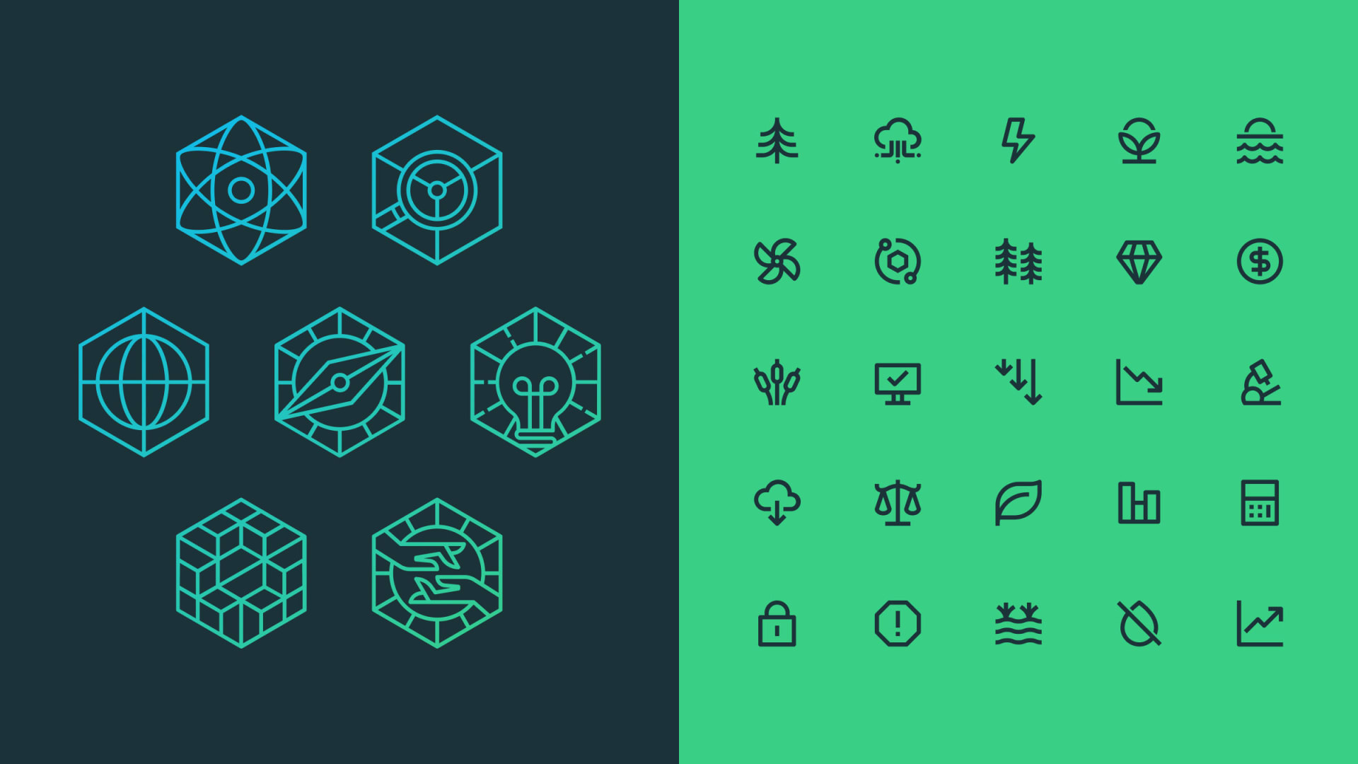
Two types of icons: expressive and functional
Explorations of pattern, typography, and layout
One benefit of a comprehensive design system is built-in accessibility. We developed a relatively large color palette to prevent designers from needing to deviate from the established system. But more options means more opportunities for error. I tested every combination of color and typography tokens to clearly establish which color combinations do and do not meet WCAG standards.
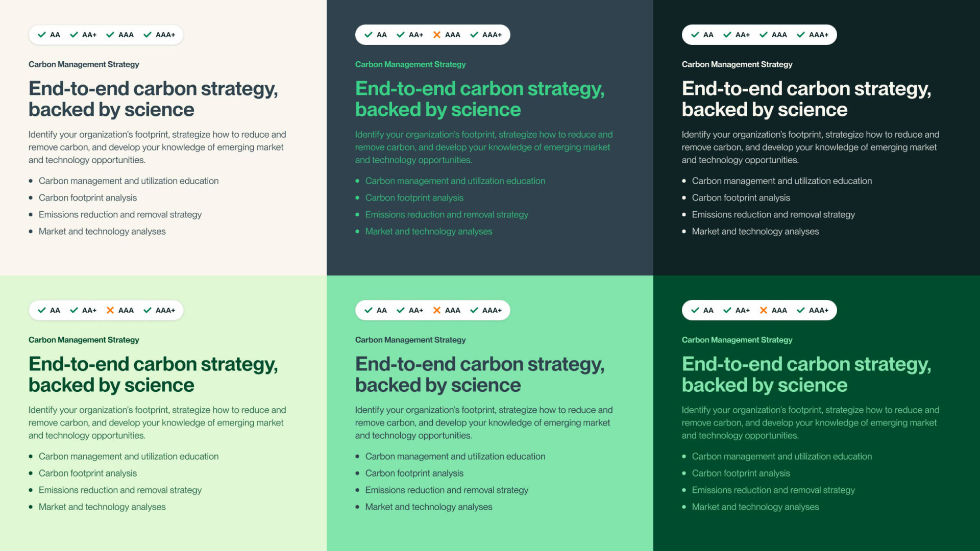
A subset of color token contrast tests
Establishing a Design System
Far and away the most significant deliverable from our scope of work was their new website. In order to establish a foundation that other designers could leverage and build upon, we established a consistent set of standards, patterns, and components in Figma and collaborated with our engineering team to ensure cohesion between our design and dev environments.
As a note, this project was completed over a year ago. Since then, Figma’s capabilities—and my own knowledge and skills—have developed significantly. In terms of implementation, I would certainly approach this project differently today. But what I wouldn't change is my dedication to creating a functional, usable design system.
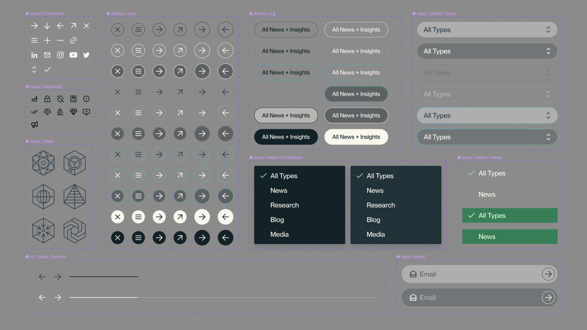
A sample of our Figma components, organized neatly
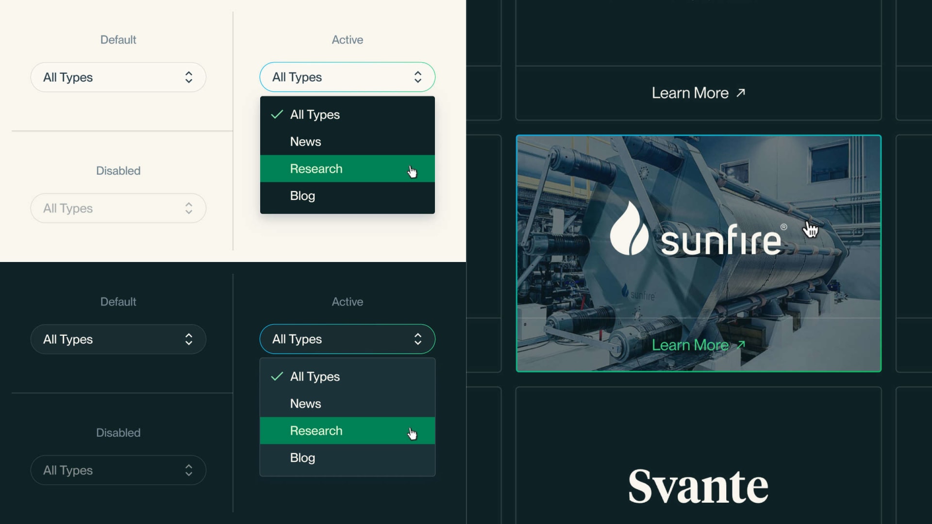
One of my favorite things about Figma is the ability to implement microinteractions like hover states in a way that is still flexible and maintainable. Small details like this can help turn what is effectively a static prototype into something that feels much more real. It also leaves less room for ambiguity when it comes to development.
A walkthrough of button hover states in Figma
Additional component specs and microinteractions
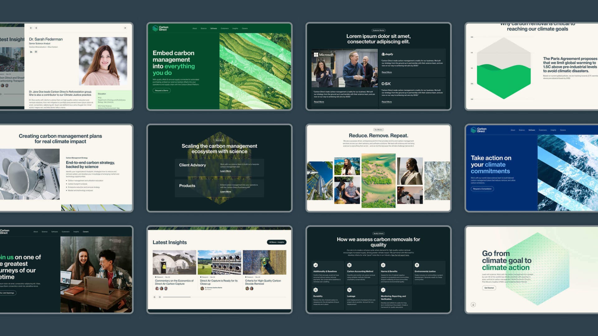
An overview of various modules from the site
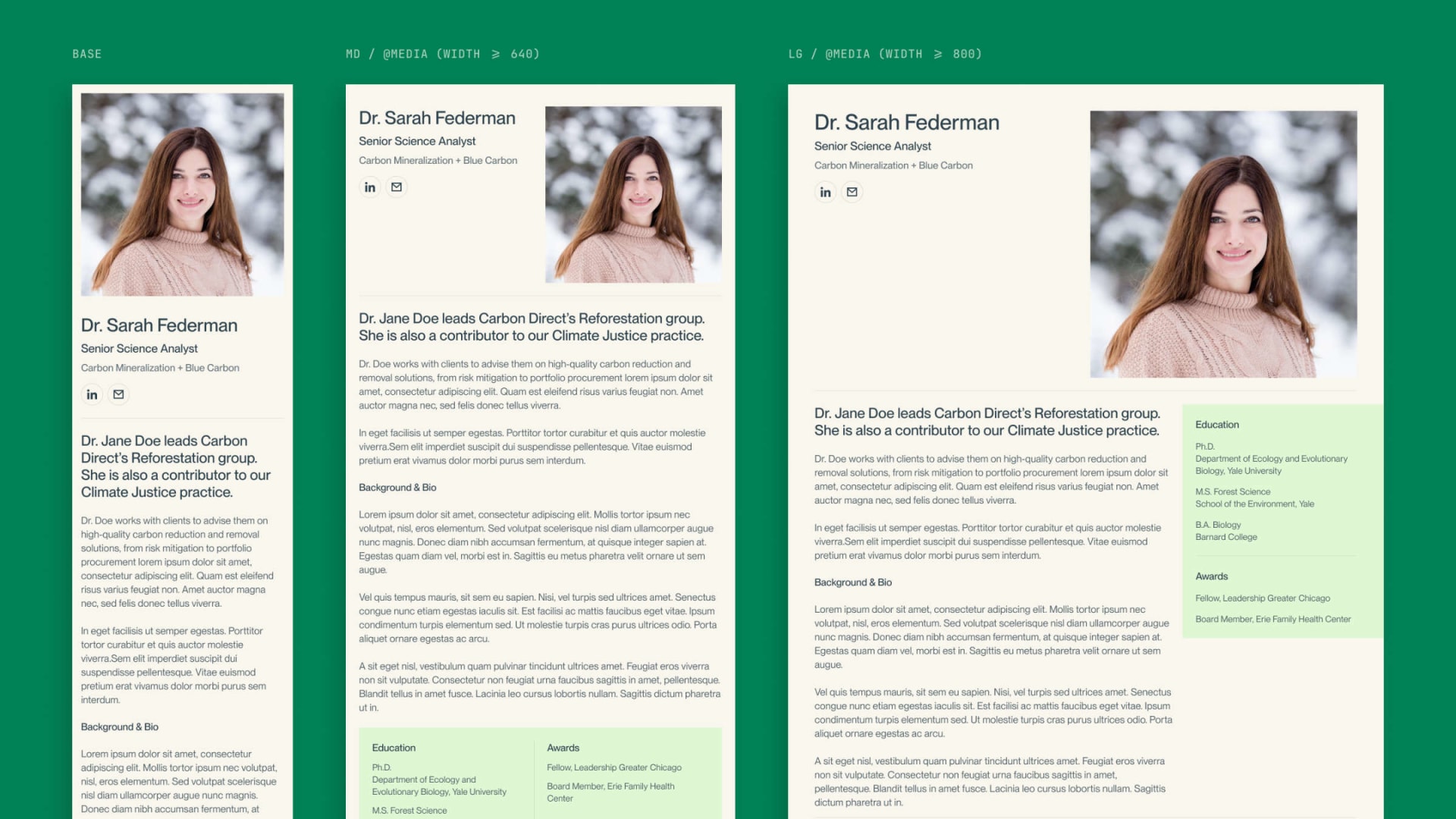
Responsive studies for the team modal
Creative Coding
The homepage hero experience—which has now, sadly, been sunsetted—was one of my favorite parts of the site and combined generative art, SVG animation, and scroll-based storytelling. Because of the somewhat unconventional nature of the design, the path to approval was long and required a lot of work on my end to prove the feasibility of the concept. I started in Figma to get preliminary approval, but eventually moved into After Effects to create a higher fidelity version of our design vision.
Once approved, I worked closely with our in-house developer Christine Hager on implementation. My primary contributions to the codebase were a canvas-based generative animation and a hand-rolled SVG animation, which we then combined together with some more bells and whistles into the final experience.
Initial implementations of the canvas and SVG animations
Final implementation of the homepage scrolling experience
Reflections and Learnings
To be honest, one of the most challenging aspects of this project wasn’t the work itself. At one point, process and interpersonal conflicts between members of the teams threatened to derail the project entirely. I’m grateful to everyone involved for being willing to sit down, discuss their issues and frustrations openly and honestly, a work together to find a path forward.
On the more technical side, I'm excited about all of the work being done to make the web a more powerful, flexible, and expressive platform. Specifically related to our work on this project, I'm excited that the Offscreen Canvas API is now stable across across all browsers. This allows us to move the heavy lifting for canvas-based animations off the main thread, which would have helped with some of the performance issues we had to resolve when developing the home hero experience.